

An attractive website isn't automatically a lead-generation website. The strongest lead generation website examples connect search intent to credibility, page hierarchy, calls to action, form friction, mobile performance, local SEO, answer-engine optimization, measurement, and actual business outcomes.
That distinction matters because dedicated landing pages have historically converted at a 6.6% median rate across industries, based on an analysis of 41,000 landing pages and 464 million visitors reported in landing-page conversion benchmark data. The number isn't a promise for every service business. It's a reminder that focused pages often outperform broad brochure-style messaging when one audience, one offer, and one action are aligned.
The examples below combine full-site references, niche-specific galleries, conversion-focused landing pages, and interactive lead flows. Use them as patterns, not templates. Copying a competitor's conversion page can create brand, legal, and strategic problems. A better approach is to identify what the page accomplishes, then rebuild the underlying logic for your own services, locations, proof, and intake process.
For businesses seeking coordinated web design, SEO, AEO, and CRO, Digital Skyrocket is a relevant benchmark. Its own website is the right place to learn about that service, while teams comparing operational tools can also browse agency software options.
Table of Contents
- 1. Digital Skyrocket
- 2. Unbounce
- 3. HubSpot
- 4. WordStream
- 5. Attorney at Law Magazine
- 6. TheeDigital
- 7. involve.me
- 7 Lead-Gen Website Examples Comparison
- Turn These Patterns Into a Lead-Ready Website
1. Digital Skyrocket
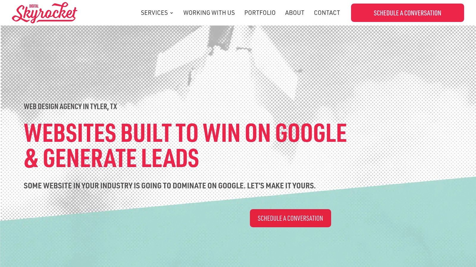
Digital Skyrocket represents the most complete model in this list because it treats a website as a search and inquiry system, not a design deliverable. The Tyler and Dallas, Texas agency builds lead-generating websites for law firms, roofers, HVAC companies, dentists, contractors, and other service businesses. Its work combines custom WordPress development, technical SEO, content strategy, AEO, local search foundations, analytics, and CRO.
The system starts with a two-step Fit and Discovery intake. That process evaluates the business, audience, current rankings, traffic, and search opportunities before major execution begins. The resulting discovery report can include keyword rankings, search traffic analysis, and an opportunity map, giving the redesign a clearer commercial purpose than “make the site look modern.”
Why the model works
Digital Skyrocket coordinates the elements that often become disconnected when several vendors work independently. Service and location architecture supports organic visibility. Page hierarchy guides visitors toward calls, forms, or emails. Performance optimization supports mobile usability. Analytics instrumentation makes lead activity measurable, while ongoing CRO refines the experience after launch.
The agency also operates with an exclusive-client model, taking only one client per industry and service area. That structure can reduce direct competitive conflicts, particularly for law firms and regional contractors competing for the same local searches.
Practical rule: A ranking project isn't finished when traffic rises. It's finished when the right visitors can quickly understand the offer and take the next step.
The public case studies provide measurable evidence, including a law firm whose Google search visitors grew from 119 to 898 per year, approximately a 646% increase, and a roofing client whose annual search visitors rose from 1,935 to 4,593, approximately a 137% increase. Those figures are reported in the agency's case-study material, not presented here as a universal forecast.
The trade-off is scope. Digital Skyrocket doesn't provide social media or paid advertising in-house, although it collaborates with vetted partners for those services. It also doesn't publish packaged pricing. Businesses must complete the Fit Meeting and Discovery process, and the agency only takes clients seeking a new website plus ongoing SEO. That's a poor fit for a company looking for instant pricing or a single full-service marketing retainer, but a strong fit for an owner who wants durable search visibility and coordinated conversion work.
2. Unbounce
Unbounce's landing page examples are useful when the immediate problem is campaign conversion rather than the architecture of an entire local-service website. The collection presents real customer pages with commentary on copy, layout, social proof, hero sections, form strategy, and calls to action.
That makes the gallery especially practical for a service business running Google Ads, Local Services Ads, or other paid campaigns. A roofing company could study how a campaign page matches its headline to an ad group, places a quote request near the decision point, and uses proof without forcing visitors to browse a general homepage. An HVAC company could adapt the same logic for an emergency repair offer, while a law firm might create separate pages for distinct practice-area intents.
What to borrow
Unbounce's strongest lesson is message match. The landing page should confirm the promise that brought the visitor there. If an ad promotes a free consultation for a specific legal matter, the page shouldn't switch to generic firm branding or make the visitor hunt for the relevant service.
Useful patterns include:
- Focused hero copy: State the service, audience, and next step immediately.
- Short conversion paths: Ask only for information the intake team needs.
- Visible proof: Place reviews, credentials, outcomes, or recognizable client evidence near the action.
- Mobile-first structure: Keep the primary call to action easy to find and use on a small screen.
Form friction deserves careful judgment. LeadSquared's form research reports a 4.7% median form conversion rate across industries, with top-quartile forms converting at 11.2% or more. The same guide reports that removing one field can improve conversion by 5% to 10%. Those figures don't mean every business should remove qualification questions. They show why the form should match the visitor's intent and the sales process.
The limitation is structural. These are primarily campaign landing pages, not full multi-location websites with service hubs, location pages, blog content, and local entity signals. Use Unbounce to improve a page inside the funnel, then build the wider SEO and AEO architecture separately. For a deeper technical review, website usability testing guidance can help identify where mobile visitors hesitate or abandon the path.
3. HubSpot
HubSpot's landing page design examples works well as a stakeholder-friendly reference library. The gallery covers consultation requests, quote forms, gated resources, booking flows, and other offer types, then explains the headline, form placement, proof, and CTA choices behind each example.
That explanatory layer is more valuable than the screenshots alone. A business owner may prefer a visually dramatic page, while the intake team may need clearer qualification. A designer may want fewer fields, while the sales team may need service type, location, timeline, and contact preferences. HubSpot's commentary gives those groups a shared vocabulary for discussing the trade-off.
Where it helps service businesses
A law firm can use the examples to separate low-commitment and high-intent actions. A visitor reading an educational article might download a guide or request an evaluation. Someone on a practice-area page may be ready to call, schedule a consultation, or submit a matter summary. Those actions shouldn't compete equally in the hero section.
A local contractor can apply the same logic to estimates, maintenance plans, and emergency calls. The page should make the primary action obvious, while secondary actions support visitors who need more information. A quote page may need a structured form, while a service article might use a lighter offer.
The best CTA is the one that describes the visitor's next benefit, not the company's internal process.
HubSpot's recognizable brands make the examples easy to present during wireframing, but the gallery has an important weakness. It rarely discloses the specific performance data behind the showcased pages. A polished design may reflect strong branding, paid traffic, an established audience, or an offer that doesn't resemble a local service inquiry.
Treat the gallery as a source of patterns and explanations, not proof that a particular layout will produce the same outcome. Validate each choice through analytics, call tracking, form completion data, and lead-quality review. Teams that need better handoff between website submissions and follow-up can also examine PBX and HubSpot sales workflows.
4. WordStream
WordStream's landing page examples takes a narrower, more campaign-oriented view. That's useful because paid traffic exposes weak message matching quickly. When a business pays for a click, sending the visitor to a generic homepage creates unnecessary distance between the ad promise and the inquiry action.
The examples emphasize CTA visibility, concise copy, friction reduction, and form design. For a home-service company, that might mean creating a dedicated page for “water heater repair” rather than routing every plumbing ad to a broad services page. For a law firm, it could mean matching each ad group to a practice-area page with a relevant consultation path and jurisdiction language.
Use it to create testable hypotheses
WordStream's practical value lies in turning design observations into experiments. Instead of saying “the form feels too long,” a team can test a shorter version against a version that asks for additional qualification. Instead of debating button color, it can test whether a clearer action label improves completed inquiries.
The traffic context matters. One benchmark cited by Apexure's landing-page guide reports a 6.6% median conversion rate across industries, while cold PPC traffic converts at 2% to 5% and warm email or retargeting traffic can reach 10% to 25%. The practical lesson is that a page shouldn't be judged without considering where its visitors came from and how much trust they already have.
A paid landing page also shouldn't replace organic architecture. It may be intentionally lean, with limited navigation and a single offer, while an SEO service page needs depth, internal links, local relevance, supporting questions, and crawlable content. WordStream is strongest for campaign optimization, not for planning a full service-area website.
Its industry-neutral approach creates another trade-off. Legal intake, emergency HVAC calls, and roofing estimates involve different urgency, risk, and qualification needs. Adapt the testing discipline, but rewrite the offer, proof, form questions, and follow-up around the actual service.
5. Attorney at Law Magazine
Attorney at Law Magazine's law firm website gallery is the most directly relevant reference for firms that need trust before conversion. Legal visitors often want to know who will handle the matter, whether the firm understands their situation, where it operates, and whether other clients have trusted it.
The featured designs provide ideas for attorney prominence, practice-area navigation, verdicts, reviews, biographies, and inquiry paths. Those elements support a trust-first hierarchy. A strong law firm website doesn't hide the lawyers behind abstract brand language. It connects the firm's people and experience to the visitor's specific legal concern.
Adapt the trust architecture
A personal injury firm can organize the site around practice areas, locations, attorney profiles, results, FAQs, and consultation actions. A family law firm may need a more restrained visual system, clearer confidentiality language, and page paths that help visitors understand the next step without exposing sensitive details.
The gallery is valuable for visual benchmarking, but it shouldn't be treated as conversion evidence. The magazine's showcased sites don't consistently provide CRO commentary or performance data, and some may prioritize aesthetics over page speed. A slow hero video or overloaded animation can dilute the very credibility the design tries to create.
For a practical build, place proof beside the decision point rather than treating testimonials as decoration at the bottom of a page. Use clear attorney credentials, relevant reviews, jurisdictional context, and specific calls to action. Keep the mobile experience direct, especially for visitors who may be searching during a stressful event.
Law firms also need to distinguish inspiration from compliance review. Claims about results, specialization, confidentiality, and client outcomes require careful internal approval. A design gallery can show what information deserves prominence, but the firm remains responsible for accuracy and ethical presentation. For a more specialized implementation path, website optimization for law firms connects trust architecture with search visibility and intake performance.
6. TheeDigital
TheeDigital's home-services portfolio shows the full-site version of lead generation. Instead of isolating one campaign page, the portfolio presents projects for plumbing, lawn care, HVAC, and related trades where service pages, locations, reviews, calls, forms, and scheduling must work together.
That broader view matters for contractors. A homeowner may enter through a “furnace repair” page, a city page, a review, or a blog article. Each route needs a logical next step. A site that looks credible on the homepage but has thin service pages or confusing location navigation will lose visitors before they reach the form.
What a contractor can adapt
The most useful pattern is the connection between service architecture and conversion architecture. Build a clear service hub, then give important services their own pages. Add legitimate service-area coverage where the company operates, and make phone and estimate actions persistent without allowing pop-ups or sticky elements to overwhelm mobile screens.
The case-study format also encourages a useful question: did the redesign improve the site as a business tool, or only as a visual portfolio piece? TheeDigital's case-study depth varies, and not every project presents detailed KPIs or controlled tests. That means readers must infer some tactics from the structures and notes rather than assuming every visual choice produced a verified result.
A service business should connect analytics to actual revenue signals. Track calls, completed forms, booked appointments, service type, location, and qualified versus unqualified inquiries. A traffic increase that produces irrelevant requests may create more work without improving sales.
A contractor's homepage should distribute intent, not absorb it.
The same principle applies to multi-location businesses. Each location needs accurate contact information, unique service relevance, internal links, and a clear relationship to the main service pages. Avoid mass-produced city pages that repeat the same copy with only the place name changed. For guidance on evaluating partners before a rebuild, use how to choose a web design agency as a planning reference.
7. involve.me
involve.me's interactive lead-generation examples explores a different conversion path. Instead of asking visitors to complete a conventional quote form immediately, the page can offer a quiz, calculator, assessment, or guided recommendation. That interaction gives the visitor a reason to continue and gives the business richer first-party information.
This pattern can be valuable when the service requires explanation before a consultation makes sense. A roofing company might use a roof-condition assessment to help a homeowner identify likely next steps. An agency might use a website-health assessment to gather information about traffic, rankings, service areas, and conversion barriers before a discovery call.
Interactivity improves qualification only when it earns attention
A quiz shouldn't be a decorative form with extra clicks. Each question should narrow the recommendation, clarify fit, or prepare the prospect for a productive conversation. If the visitor answers several questions and receives a generic “contact us” message, the interaction feels like a data grab.
The format also creates technical obligations. Interactive tools must load quickly, work with keyboard and screen-reader navigation, preserve progress where appropriate, and remain usable on mobile. Embedded scripts can affect performance, analytics, and privacy controls. A WordPress site should treat the tool as part of the conversion system, not as an isolated marketing widget.
The examples include B2B and B2C formats, so local businesses must adapt the offer carefully. An interactive flow may suit complex remodeling, commercial HVAC, financial services, or legal intake triage. It may be unnecessary for an urgent service where the visitor needs a phone number and immediate availability.
Performance figures shown in the gallery are illustrative rather than audited. Judge the implementation by completed assessments, qualified inquiries, booked consultations, and downstream outcomes. A longer interactive path can improve lead context, but it can also reduce completion if the visitor's intent is urgent or the questions feel intrusive.
7 Lead-Gen Website Examples Comparison
| Solution | Implementation complexity 🔄 | Resource requirements ⚡ | Expected outcomes ⭐📊 | Ideal use cases 💡 | Key advantages ⭐ |
|---|---|---|---|---|---|
| Digital Skyrocket | High, custom WordPress + technical SEO, two-step discovery 🔄 | Medium–High, custom build + ongoing SEO retainer; partners for ads ⚡ | High, durable page‑one rankings and measurable organic lead growth (documented case studies) ⭐📊 | Local service businesses needing new site + long‑term SEO (law, roofing, HVAC, dental) 💡 | Exclusive client intake, evidence‑based discovery, CRO + SEO integrated ⭐ |
| Unbounce – 15 High‑Converting Landing Page Examples | Low–Medium, annotated templates and patterns; easy to adapt 🔄 | Low, quick to implement for campaign pages; minimal dev overhead ⚡ | Medium, clear conversion tactics for landing pages; focused on CTR/lead lift ⭐📊 | Paid‑traffic landing pages, short campaign funnels, mobile PPC creatives 💡 | Actionable teardowns with “why it works” notes; mobile/PPC emphasis ⭐ |
| HubSpot – 45 Landing Page Design Examples | Low–Medium, gallery + explanations for design rationale 🔄 | Low, reference resource; requires design resources to implement ⚡ | Medium, helps align stakeholders and refine offers; limited performance metrics ⭐📊 | Wireframing, stakeholder buy‑in, lead magnets and booking flows 💡 | Broad, current examples with clear rationales and recognizable brands ⭐ |
| WordStream – Best Landing Page Examples | Low, pragmatic, PPC‑centric annotated examples 🔄 | Low, easy to translate into A/B tests for paid campaigns ⚡ | Medium, practical conversion gains for paid traffic when applied correctly ⭐📊 | Google Ads/Local Services Ads landers; quick PPC optimizations 💡 | PPC‑focused guidance on message match, friction reduction and CTA clarity ⭐ |
| Attorney at Law Magazine – Best Law Firm Websites | Low–Medium, curated law‑specific site gallery; implementation varies 🔄 | Medium, requires content for trust signals (profiles, verdicts, reviews) ⚡ | Medium, improves credibility and intake UX; limited CRO data disclosed ⭐📊 | Law firm benchmarking, trust‑first layouts, intake UX design 💡 | Sector‑specific inspiration for legal trust signals and localization ⭐ |
| TheeDigital – Home Services Portfolio & Case Studies | Medium–High, full‑site builds plus SEO integration; case study driven 🔄 | High, full website redesigns, multi‑location structures, SEO resources ⚡ | High, whole‑site lead generation improvements shown in case notes ⭐📊 | Home services and multi‑location businesses needing end‑to‑end lead engines 💡 | Demonstrates full‑site strategy, location/service‑area patterns, measurable outcomes ⭐ |
| involve.me – 10 Best Lead Gen Landing Page Examples (interactive) | Medium, interactive tools (quizzes, calculators) require integration 🔄 | Medium, dev/integration + content for assessments and gating ⚡ | Medium–High, better lead quality, higher engagement and pre‑qualification ⭐📊 | Brands needing differentiation, pre‑qualification, richer first‑party data across locations 💡 | Shows interactivity to boost conversion quality and lead qualification ⭐ |
Turn These Patterns Into a Lead-Ready Website
The strongest examples share a practical sequence. They don't begin with visual style. They begin by matching each page to a search intent and a decision stage. A service page should answer a service question. A location page should establish legitimate local relevance. A consultation page should make the next action clear. A campaign landing page should preserve message match from the ad.
Next, make the hierarchy explicit. Organize services, locations, attorneys or technicians, proof, educational content, and contact paths so users and search systems can understand the relationships. This structure supports SEO and AEO because direct answers, clear entities, descriptive headings, internal links, and consistent business information give search engines more useful context.
Credibility belongs above the fold, but it must be specific. Law firms can lead with attorney identity, practice-area relevance, reviews, and approved results. Contractors can show service coverage, workmanship evidence, warranties where applicable, licensing information, and real customer feedback. Avoid invented claims and generic badges that don't help a visitor decide.
Then reduce contact friction without sacrificing qualification. A short form may increase submissions, while a carefully selected service type, location, timeline, or matter category may help the team respond appropriately. One benchmark cited by Martal's lead-generation data places average website conversion at 2.23%, with strong lead-to-customer conversion at 10% to 20% when leads are well qualified. The lesson is to optimize for useful inquiries, not form volume alone.
A practical rollout order
- Map search intent: Assign every important page a clear audience, need, service, and location.
- Build trust first: Put relevant proof, people, credentials, and expectations near the primary action.
- Simplify the path: Make calls, forms, booking, and secondary research actions easy to find on mobile.
- Instrument activity: Track calls, forms, booking completions, source, service, location, and qualification.
- Improve discoverability: Address technical SEO, local SEO, structured content, AEO, speed, and internal linking.
- Test one meaningful change: Compare a new form, CTA, proof block, page hierarchy, or qualification flow against lead quality.
Choose one primary improvement for your niche. A law firm may gain the most from trust architecture and clearer intake. A roofer, HVAC company, or other contractor may need stronger service-area structure. A complex consultancy or high-value service may benefit from a qualification assessment rather than another generic “Contact Us” button.
Local search deserves priority because the intent can be immediate. Industry summaries cited by local SEO conversion research report that SEO leads close at 14.6%, compared with 1.7% for cold outbound leads. Those figures reinforce the value of building pages that answer real search demand and make local inquiries easy, though every business should measure its own pipeline.
Finally, borrow the pattern, not the competitor's conversion page. Digital Skyrocket is a relevant option for businesses seeking a new website plus ongoing SEO, AEO, CRO, and local search support, particularly law firms, home-service companies, and other service businesses that want their website and search strategy managed as one system. Teams that need trained outbound support can also explore an Appointment Setter after the website begins producing qualified inquiries.
Digital Skyrocket builds custom WordPress websites for service businesses, combining technical SEO, AEO, local search strategy, analytics, and CRO to turn search visibility into qualified calls and forms. If your law firm, roofing company, HVAC business, dental practice, or regional service company needs a new website plus ongoing SEO, visit Digital Skyrocket to explore the Fit Meeting and Discovery process.