Most service websites don't fail because they look bad. They fail because a homeowner, tenant, or business buyer can't figure out what to do next, and that hesitation shows up as a missed call, an abandoned form, or a quote request that never gets finished. In practice, I've watched polished law firm and roofing sites win traffic from local SEO, then lose the lead at the exact moment trust, clarity, or speed mattered most.
Website usability testing is how you find those leaks before they keep costing you inquiries. The useful version isn't about collecting opinions on colors or arguing over button shapes, it's about watching real people try to contact you, compare you with competitors, and decide whether your site feels worth trusting.
Table of Contents
- Why Your Service Website Needs Structured Usability Testing
- Planning Your First Usability Study with Clear Objectives
- Recruiting Participants and Running Effective Test Sessions
- Measuring What Matters with Core Usability Metrics
- Analyzing Session Data and Prioritizing Fixes That Drive Conversions
- Testing Accessibility as a Core Usability Requirement
- Building a Continuous Testing Cadence for Ongoing Improvement
Why Your Service Website Needs Structured Usability Testing
A roofing company can rank well locally, get steady traffic, and still lose qualified homeowners because the quote path feels unclear. The owner usually sees dashboard numbers and maybe a few heatmaps, then assumes the site is doing its job. A real visitor lands on the homepage, scans the service pages, pauses at the contact form, and leaves without saying what got in the way.
That gap is why structured website usability testing matters. Analytics can show where people drop off, but not whether they got stuck, felt unsure, or stopped trusting the page enough to continue. Nielsen Norman Group treats success rate, time on task, error rate, and subjective satisfaction as core usability metrics. MeasuringU's benchmark work also gives teams a useful baseline for core journeys like finding services or requesting a quote, including average task completion rates and SUS scores across large dataset samples. Those benchmarks help separate a small irritation from a lead-killing problem, especially on pages that have to produce calls, emails, and form submissions. (NNGroup usability metrics)
Why polished doesn't mean usable
A site can look credible and still block leads. VWO notes that 47% of visitors want a webpage to load in less than 2 seconds, 88% of online consumers are less likely to return after a bad experience, and 75% of website credibility comes from design (VWO usability testing statistics). Those numbers explain why visual polish alone does not rescue a weak intake path, because speed perception and trust affect whether someone feels comfortable calling or submitting their details.
Practical rule: if the user has to think hard about what happens after the click, you are already losing leads.
Testing belongs before a redesign goes live, right after a major content change, and whenever a key page underperforms relative to the traffic it receives. That matters even more for service businesses, where the goal is not generic engagement. It is calls, emails, and form submissions.
If your HVAC site needs clearer service paths and better user flow, this HVAC website design resource shows how structure and conversion intent have to work together.
Planning Your First Usability Study with Clear Objectives
Good tests start with a question that can be answered. “Do people like our website?” is too vague to guide recruiting, task design, or analysis. “Why do visitors abandon the contact form after reaching the phone number field?” is the kind of question that leads to useful observations, because it points straight at a specific conversion leak.
Write the question before you write the tasks
For a law firm, the question might be whether prospective clients can find the right practice area and feel confident enough to start intake. For a roofer, it might be whether emergency repair visitors can get from the homepage to a same-day quote request without detouring through service pages that don't answer the problem. The research question determines the participant profile, the pages to test, and the language you use in each task.
A strong task script sounds like a real customer journey. A weak one sounds like a classroom exercise.
- Good prompt: “You just noticed a roof leak after a storm. Find the most relevant page and request help as quickly as you can.”
- Weak prompt: “Click around and tell me what you think of the navigation.”
- Good prompt: “You need a same-day consultation for a personal injury matter. Show me how you'd contact the firm.”
- Weak prompt: “See if the site feels easy to use.”
A credible website usability test script should state the site's goals, the tasks users must perform, and the scenarios that trigger those tasks, along with the metrics you'll measure, such as time, navigation quality, and errors (LSNTAP website usability testing guide). That kind of structure makes the results easier to compare across pages and redesigns.
Use a one-hour session structure that separates behavior from opinion
For a typical one-hour session, a short pre-test interview, about 10 to 20 realistic scenarios, and a post-test interview create a clean split between task performance and subjective satisfaction (NNGroup analyze usability data). I like that format because it keeps participants moving while still leaving room for the honest, messy comments that reveal friction.
Avoid questions that ask people to predict their own behavior. They're usually wrong about what they'd do, but they're very good at explaining what just confused them.
Run a pilot before the full study. One pilot session will usually expose leading language, awkward timing, or tasks that are too broad. It's cheaper to fix the script than to discover halfway through the study that every participant interpreted the task differently.
If you need help shaping the study around search intent and user behavior, the search experience optimization page is a useful companion to the research planning process.
Recruiting Participants and Running Effective Test Sessions
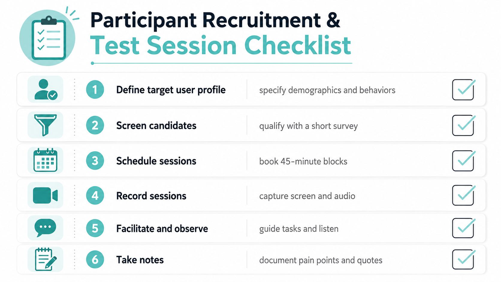
The biggest mistake I see is teams recruiting convenient people instead of relevant people. A homeowner actively comparing local roofers will notice different problems than a friend who “just wants to help out,” and that difference changes the quality of every observation you collect. If the participant doesn't resemble the actual buyer, the session becomes theater.
Find the right people, then keep the session realistic
Customer lists are the cleanest source when you already serve the right audience, but they're not the only option. Local community groups, referrals, and screening surveys can work well if the screener filters out professional testers and captures the behaviors that matter, such as recent service use, device preference, or urgency of need. For law firms, the relevant filter might be someone recently searching for legal help. For contractors, it might be a homeowner in a realistic service area who's comparing options.
The good news is that you don't need a huge sample to find meaningful problems. Nielsen and Landauer's widely cited finding is that testing with as few as 3 to 5 participants can uncover about 80% of usability problems when you iterate continuously (U.S. Department of Energy usability testing best practices). That makes small rounds practical, especially for service companies that need quick answers instead of a giant research project.
Moderate carefully so participants tell you what they really think
Moderated sessions work best when you want to hear the reasoning behind each click. Unmoderated testing is fine when you only need broad pattern recognition, but it won't give you the same depth when a participant stalls at a form or misunderstands a service page. The moderation skill is restraint. You're there to guide the task, not rescue the participant.
Use think-aloud prompts sparingly. “What's going through your mind right now?” and “Was anything about this frustrating?” usually produce better insight than a long list of opinion questions. If someone gets stuck, let the silence breathe for a moment. People often explain the issue right after they hit the barrier.
Participants often reveal more after a mistake than before it. Don't interrupt the struggle too early.
Split sessions into short iterations if you can. Three rounds of two users each gives you a chance to refine the interface and verify that the fix helps, rather than assuming the first repair solved the issue. That rhythm keeps research close to the work of CRO instead of turning it into a one-off report.
Measuring What Matters with Core Usability Metrics
A lead-generating site needs more than a simple finish line. A visitor can complete the form and still hesitate, hit errors, or lose confidence halfway through, which means the conversion path still has problems. I treat task success rate, time on task, error rate, and subjective satisfaction as one set of signals, because the lead outcome depends on how they work together.
Metrics that reveal user friction
Success rate is the cleanest place to start, because it shows the percentage of users who completed the task. Nielsen Norman Group defines it that way, and the metric works because it turns a subjective impression into a measurable result (NNGroup success rate). A completed task is still only part of the story. A person can finish and still have fought the page the whole way.
| Core Usability Metrics for Service Websites | Definition | Benchmark | Lead Gen Relevance |
|---|---|---|---|
| Task success rate | The percentage of users who complete the task | MeasuringU reports an average task completion rate of 78% across 500 datasets | High. If users can't complete contact or quote tasks, leads drop |
| Time on task | How long it takes a user to finish a realistic task | No single universal benchmark applies | High. Slow intake paths often suppress calls and form submissions |
| Error rate | How often users make mistakes while completing the task | No single universal benchmark applies | High. Form errors and navigation mistakes kill momentum |
| Subjective satisfaction | How people feel about the experience | MeasuringU reports an average SUS of 68 across 500 datasets | High. Confidence and trust affect whether users submit |
The table is useful because it separates speed, accuracy, and confidence. Those are different problems, and service sites usually lose leads when teams treat them as the same thing. A visitor who can get through the contact flow slowly is not the same as one who moves through it with confidence. For practical CRO context, see this conversion rate optimization guide, which connects page behavior to lead outcomes rather than design preferences.
Why binary thinking misses friction
A user can complete a task and still leave uncertain. That matters in service businesses because the final decision often happens in a narrow trust window. If someone has to correct a form field twice, backtrack to find a phone number, or guess whether they reached the right department, the site may still count as usable while reducing the quality of the lead.
A standardized metric like the System Usability Scale helps compare pages and redesigns over time, but it works best beside the session notes, not instead of them. The score shows where friction is concentrated. The recording shows why people hesitated, what confused them, and whether the problem sits on the path to a call, a form submission, or a quote request.
For a practical CRO framing, Wojo Media's overview of what is CRO and why it's key is a useful complement, because it ties behavior change to business outcomes instead of design taste. That is the right lens for service websites, where a form that technically works can still cost real inquiries.
Analyzing Session Data and Prioritizing Fixes That Drive Conversions
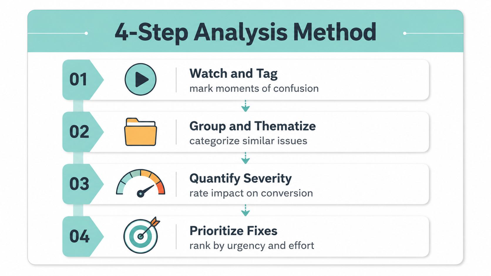
Raw session notes are messy on purpose. The job is not to count every comment equally, it's to separate one-off reactions from recurring friction that affects whether people become leads. That's where a structured analysis workflow earns its keep.
Turn recordings into patterns, not a pile of anecdotes
The cleanest process is simple. First, collect relevant observations and quotes. Second, check whether the same issue appears across participants. Third, explain the pattern in plain language. Fourth, verify that your explanation fits the evidence instead of forcing the evidence to fit your favorite idea.
That framework matters because dramatic failures can distract teams from the repeated frustrations that suppress conversions. A single participant who gets lost in a strange corner of the site may be interesting, but three participants pausing at the same form label is a real product signal. If the same block shows up on mobile and desktop, it's no longer a design quirk, it's a business problem.
Use repeated friction as your prioritization anchor. If several users hit the same barrier on the path to contact, fix that before polishing anything cosmetic.
Prioritize by conversion impact, not by loudness
Some issues deserve fast action because they sit close to the lead moment. Others are structural and take longer to repair. A form label that confuses users is usually more urgent than a minor visual inconsistency, even if the visual issue looks worse in a presentation. That's the CRO lens that keeps the work grounded.
A useful reporting package includes three parts. One version for design and development, one version for stakeholders, and one version for the people who own leads. Keep the language plain. Say which task broke, what users expected, and how the friction likely affects calls, emails, or quote requests.
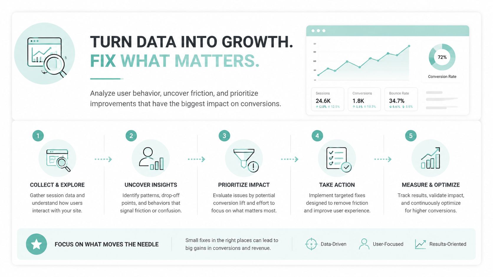
The internal change request should name the fix, the reason it matters, and the page where it belongs. If you're comparing this work to broader conversion strategy, the conversion rate optimization overview is a helpful companion because it connects usability findings to testing, iteration, and form flow improvements.
Testing Accessibility as a Core Usability Requirement
Accessibility can't live in a separate lane if the website is supposed to generate leads for real people. A visually polished interface can still be unusable when keyboard users can't move through the form, screen-reader users can't understand labels, or focus order traps someone in the wrong part of the page. That's not a bonus issue. It's a usability failure.
Build inclusive testing into the study from the start
Mainstream usability guidance still tends to default to generic task completion, but inclusive testing works better when participants with disabilities are part of the study design, not added after launch. That means recruiting people who use screen readers, keyboard navigation, and other assistive technologies, then giving them realistic tasks that match your business flows. A person trying to request an emergency repair quote shouldn't have to fight the interface just to reach the contact step.
The most common accessibility problems are also conversion problems. Missing form labels, unclear focus order, and broken keyboard paths interrupt the same intake journey that everyone else relies on. If a field can't be reached cleanly or the feedback doesn't make sense, the user may abandon the task before they ever ask for help.
Treat accessibility as a live workflow issue
The reason this matters so much for service sites is that many of them lean heavily on forms, phone calls, and appointment requests. Those paths need to work in real-world conditions, not just in a desktop browser with a mouse. The W3C's accessibility usability-testing guidance and the U.S. Department of Energy both emphasize representative users, realistic tasks, and avoiding leading prompts, because accessibility issues often appear only when someone is trying to complete the job with assistive tech.
A site can pass a visual review and still fail a keyboard user in the first 10 seconds.
For regulated industries and public-facing service businesses, that's reason enough to include accessibility specialists when the issue is complex or legal risk is high. But even without a specialist in the room, your existing usability process should catch the most obvious blockers. If the participant can't get through the task without help, the site isn't ready.
Building a Continuous Testing Cadence for Ongoing Improvement
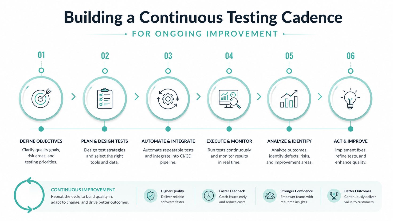
One usability audit doesn't create a durable lead machine. Websites change too often for that, with new service pages, revised forms, seasonal offers, and location content all shifting the experience over time. The smarter move is a steady testing cadence that keeps validation close to the edits.
Small, repeated studies beat one giant review
A practical rhythm for a small service business is lightweight studies with three to five participants, then a retest after changes go live. That aligns with the earlier research on small samples uncovering most major usability issues while keeping the process affordable and fast. It also stops teams from mistaking a fresh redesign for a finished system.
A simple 12-month cadence can look like this:
- Quarter 1: Test the homepage, primary service page, and contact path.
- Quarter 2: Test location pages and mobile-first quote flows.
- Quarter 3: Retest the most important fix from the first round.
- Quarter 4: Review analytics, run another small study, and compare the new observations with the earlier ones.
That cycle works because it combines qualitative testing with the measurement habits already used in CRO and SEO. Analytics tell you what changed. Usability sessions tell you why.
Make testing part of the way the site evolves
The best teams don't treat user research as a special event. They fold it into redesigns, form updates, and content changes, then use the findings to shape the next version of the site. That's especially important for lead generation sites, where even a small change in CTA clarity, trust signals, or form length can influence inquiry volume.
A practical setup is to schedule mini studies whenever the site gains a meaningful new page or flow. Retest the path after each fix, and keep the notes short enough that the team will read them. If the same problem reappears, it's a sign the issue wasn't solved the first time.
If you want a team that plans lead-generation websites around search, structure, and conversion from the start, Digital Skyrocket builds and optimizes service sites with usability and inquiry flow in mind. Reach out if your current site gets traffic but doesn't turn enough of it into calls, form submissions, or quote requests, and you want a process that connects testing to real business outcomes.