3,948 ADA website lawsuits were filed in 2025, up 23.84% from 2024, according to a report discussed by the Oklahoma Bar Association. The recurring problems were missing labels, low contrast, unclear controls, and keyboard barriers.
That number should change how you shop for a law firm website template. A theme demo can look finished and still fail the person trying to hire you. The audit that matters is the intake path. Test the consultation request, the case-evaluation form, and any document upload before you judge the homepage slider. A contact form, a PDF, a chat bubble, or a cookie banner can block a prospective client even when the demo runs smoothly.
Owners and marketing directors at small and mid-sized firms should judge the shortlist by what a visitor can finish. A web design agency can build the pages, but the pass-fail test is still yours. A template is a floor plan you furnish. It still needs an accessibility pass, an ethics review, and a working path from first click to signed engagement.
Table of Contents
- What a Law Firm Website Template Actually Contains
- Pros and Cons of Using a Law Firm Template
- Selection Criteria Every Template Should Pass
- Migration, CMS and Technical Choices
- Core Web Vitals and Accessibility Thresholds to Test
- Customize and Launch the Template Checklist
- Choose a Template or Custom Build for Your Firm
What a Law Firm Website Template Actually Contains
One attorney client's site went from 119 Google search visitors a year to 898 after a rebuild, a 645.62% increase. The lesson for template shopping is that the pages and forms behind the design do the work, not the demo screenshot.
A law firm website template supplies a starting shell: page layouts, navigation, practice-area pages, attorney profile layouts, contact and intake forms, and a content management system. You fill those slots with your own copy and photos.
The shell has a predictable order. A parent searching after a crash lands on the site from a phone at 9 p.m. and meets these pieces:
- Home page: A phone number and a short form sit where a thumb can reach them.
- Practice-area pages: These state what you handle, in which courts, and what the first call covers.
- Attorney bios: Visitors look for a person, not a logo.
- Location pages: These tie the firm to the cities you serve.
- Contact page: The inquiry either finishes or dies here.
- Resource or blog section: Answers live here as real HTML, not text baked into a slider image.
- Footer: This carries the responsible lawyer or firm name and a way to reach you.
Partner profiles, associate pages, and a name-and-phone form are baseline features on a law firm site. If a template treats any of them as an upgrade, the demo is finished before the intake path is. The phone-number field is the handoff from a search result to a case.
Where themes still fall short
A theme can ship with a contact form that looks complete and still fail the person using it. The common failures are structural: labels that vanish when a field is filled, a submit button hidden under a chat bubble, a PDF that cannot be read on a phone, or a cookie banner that traps keyboard focus. Secure pages and a working phone or form belong in the build. Chat is optional.
If you add chat, test it the way a tired client would, including after hours. A tool built for AI live chat for service businesses only helps when the widget does not cover the submit button or trap keyboard focus.
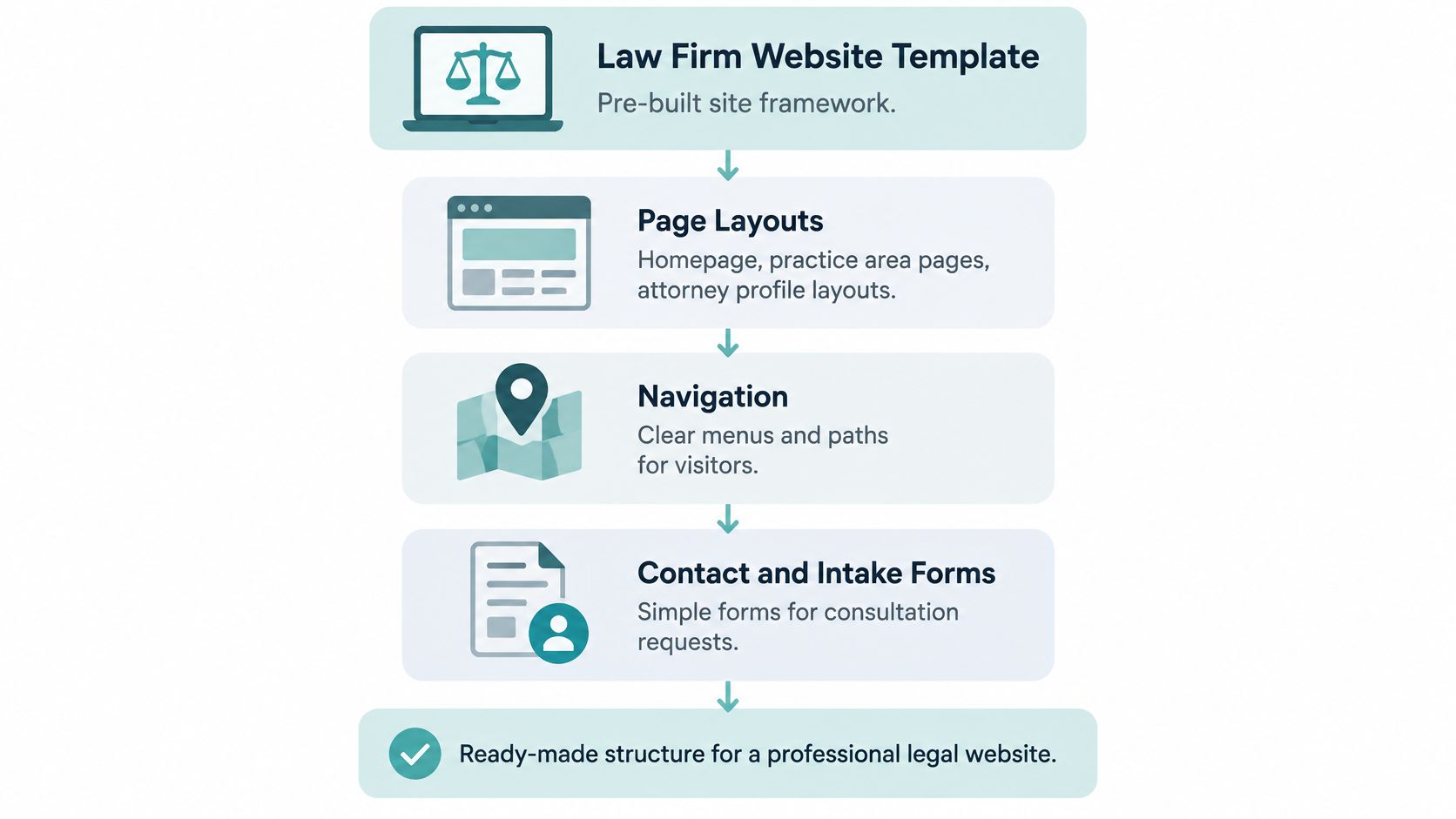
Before anyone debates colors, list what the template must include. You need a home page, practice pages, bios, locations, contact, a resource area, footer identity, HTTPS, and a form that can take a name and a phone number. If the demo is missing one of those, the look does not matter yet.
Pros and Cons of Using a Law Firm Template
A template wins on speed and loses on control. The trade-off shows up after launch, when staff try to change a form the theme never planned for.
What you gain
- Lower upfront cost: You pay for configuration, not a ground-up design system.
- Faster first launch: Layouts for bios, practice pages, and contact flows are already drawn.
- Easier upkeep: Matching structure across practice areas means one edit pattern, not twelve.
- A known CMS: Staff can change hours, bios, and blog posts without a developer on every line.
What you inherit
- A shared look: The same hero, fonts, and gavel photos show up on competitor sites.
- A fixed intake: Multi-step screening, conflict checks, and odd routing stop at the theme's form builder.
- Hidden risk: Sliders, unlabeled PDFs, chat widgets, and cookie banners arrive with the theme.
- Plugin lock-in: Leaving later can mean rebuilding every page the vendor's add-ons created.
The American Bar Association reported 2024 website adoption of 70% among solo practitioners, 91% among firms with 2–9 attorneys, 98% among firms with 10–49 attorneys, and 100% among firms with 100 or more attorneys. Smaller firms gain the most from a fast, proven start, because many of them are still the ones without a site.

Two firms, two answers
A two-attorney family practice with one office and a short consult form fits a template well. Practice pages match the theme. Intake is name, phone, a short note, and a callback. Custom design would delay the first lead without changing that path.
A fifteen-attorney injury firm with multi-step case screening usually outgrows the same theme. Staff need injury type, treatment status, and jurisdiction before a lawyer sees the file. Forcing that into a one-page contact form creates bad leads and abandoned forms. I would start that firm on a custom intake, even if the marketing pages begin from a proven layout.
Practical rule: If your intake matches the template's forms and your practice areas match its page structure, the trade-off favors the template. If either one doesn't, budget for a rebuild before you sign.
Selection Criteria Every Template Should Pass
Score the live demo, not the sales page. A template that fails two or more rows below needs a written fix plan before you pay. "We'll customize that later" is how firms launch a site they can't edit.
| Criterion | What to verify | Pass signal |
|---|---|---|
| SEO foundation | Editable titles, meta descriptions and heading order | Every practice page editable without code |
| Local search | Practice and location pages with consistent business details | Name, address and phone match across the site |
| Answer engine readiness | Question-led sections and attorney attribution | Each practice page answers a question under a named attorney |
| Accessibility | Keyboard use, form labels, contrast and alternative text | Forms can be completed without a mouse |
| Conversion UX | Phone and form calls to action above the fold | Intake form asks only for initial inquiry details |
How to read each row
SEO foundation. Open a practice page in the editor. If the title, meta description, and H1 require a developer, fail it. Body text must be real HTML. Critical copy inside an image never gets indexed cleanly.
Local search. Google says local results are mainly set by relevance, distance, and prominence. Relevance is how closely a Business Profile matches the search. Distance is how far the business is from the searcher or the place named in the query. Prominence is how well known the business is, and links plus review volume feed that. The template needs separate practice and location pages, one name-address-phone pattern, and a place for reviews and citations. Our off-site work builds those citations on sites such as Yelp and Yellow Pages and earns links from other authoritative sources. On-page, the template still has to show the same details everywhere.
Answer engine readiness. A short, attributed answer belongs high on each practice page, because that block may be the only text a prospect ever reads. The American Bar Association, citing Bain research in 2025, reported that four out of five consumers used AI-generated summaries for at least 40% of searches, that organic traffic fell 15%–25%, and that 60% of searches ended without a click after an AI-generated answer. Visibility in those answers can't be guaranteed. What you can do is publish a jurisdiction-specific explanation under a named attorney, in crawlable HTML, with a clear next step. A generic "What is negligence?" page doesn't qualify. For a fuller build path, see our notes on legal website design.
Accessibility. Tab through the form with a mouse unplugged. Labels, focus, contrast, and alternative text either work or they don't.
Conversion UX. The phone number and form link sit above the fold. The form asks only for an initial inquiry and says what happens next. It doesn't imply you've been retained.
If two rows fail and the vendor can't show the fix on a staging URL, walk away.
Migration, CMS and Technical Choices
Google uses mobile-first indexing, which means it primarily uses the smartphone version of a page for indexing and ranking. It recommends responsive design because the same HTML is served at the same URL on desktop, tablet, phone, and non-visual browsers, while the layout adapts. Bios, service pages, contact details, and intake forms have to be present and usable on a phone. Hiding the form on small screens to "clean up" the design removes the page Google reads.

Move the URLs before you move the look
Do the migration in the order the team will work.
- Map every old URL to its new equivalent, including blog posts, attorney pages, and PDFs people already link to.
- Use 301 redirects for pages that already rank. Keep the title and the substance of the body. A prettier H1 that drops the practice name is a ranking cut, not a refresh.
- Launch, then check indexing in Search Console. Look for redirect chains, soft 404s, and pages stuck on the old host.
Say a 300-page firm site moves the blog cleanly, but the practice pages lose their redirects. Those URLs 404 for weeks. Rankings slip, and the new design gets blamed for a redirect spreadsheet nobody finished. A technical SEO for law firms pass before launch is cheaper than rebuilding authority after the drop. Outside help on technical SEO services is worth it when your team doesn't already live in crawl reports.
Questions to ask before you sign
Ask who controls hosting and the domain, which plugins the template needs, how often the theme is updated, and whether you can export every page if you leave. Once you've paid for a site we build, it belongs to you, and if you later cancel service it stays live. Put the same expectation in writing with any other vendor.
Three questions belong in the contract conversation.
- Who owns the files, including the theme, the database, and the domain registration?
- How is migration handled, including the redirect map and who monitors it for the first month?
- What happens to rankings during the switch, and who is responsible if key URLs aren't redirected?
If the answers are verbal only, you don't have them.
Core Web Vitals and Accessibility Thresholds to Test
Don't trust a site-wide speed score. A fast blog can hide a slow contact page. Test each high-value template on its own: practice-area pages, attorney profiles, location pages, and the contact page.
Google's Core Web Vitals guidance calls a page "good" when Largest Contentful Paint is no more than 2.5 seconds, Interaction to Next Paint is no more than 200 milliseconds, and Cumulative Layout Shift is no more than 0.1. Those cuts use field data, split by mobile and desktop. Search Console groups URLs and separates devices, which is the report to use.
| Metric | Good threshold | Template fix |
|---|---|---|
| Largest Contentful Paint | 2.5 seconds or less | Compress hero images and attorney headshots, and prioritize above-the-fold media |
| Interaction to Next Paint | 200 milliseconds or less | Defer chat, scheduling and animation scripts |
| Cumulative Layout Shift | 0.1 or less | Reserve dimensions for badges, embeds and widgets |
Run three steps on every group that matters.
- Check field data for that template type and flag any group that misses a threshold.
- Run a lab test to name the script, image, font, or third-party widget behind the miss.
- Fix that dependency and retest the same URL group.
A hero slider loading an uncompressed image delays the largest element on every practice page. One template change fixes the set. Page-by-page edits don't.
Pair that with an accessibility pass on the same URLs: visible focus, descriptive errors, captioned video, and contrast aimed at WCAG 2.2 AA. An overlay widget never replaces a manual pass on forms and PDFs. On a phone, a late form tap is a lost consult.
Customize and Launch the Template Checklist
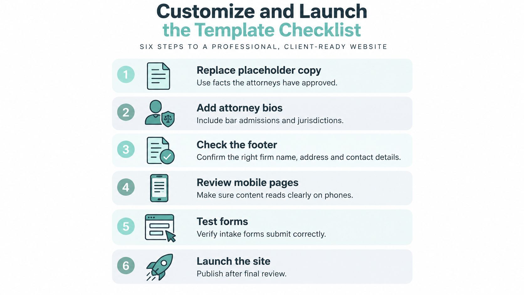
Template demos look finished. Live sites are not. The distance between the two is a short queue of placeholder verdicts, unlabeled forms and a footer with no responsible attorney on it, and every item in that queue costs less to fix before launch than after a prospective client notices it.
Work the list in this order.
- Replace placeholder copy with facts the attorneys have approved, so the site doesn't publish another firm's sample verdicts and testimonials.
- Add attorney bios with bar admissions and the jurisdictions where each lawyer practices. A bio listing three offices and one license reads as a claim nobody checked.
- Check the footer for the name and contact information of at least one responsible lawyer or firm. ABA Model Rule 7.2 requires it on every communication made under the rule, and the footer is the communication firms forget most often.
- Confirm any specialist badge names the certifying body on the same page as the claim. Footer and profile pages are where these gaps show up first.
- Configure forms with semantic labels, descriptive errors, a confidentiality notice before sensitive details, HTTPS, and server-side validation. Collect only what an initial inquiry needs, and say what happens next.
- Fix or remove hero sliders, add alternative text to meaningful images and PDFs, and caption videos.
- Set up tracking for calls, form submissions, and booked consultations before launch day, not the week after.
- Test the full intake path with a keyboard and a screen reader, including error states.
- Review every key page on a phone before sign-off. Sites built by Digital Skyrocket are designed to read clearly on phones, tablets, and desktops, and a template that ships to your firm should meet that same bar.
Why the intake path is the real sign-off
Under ADA Title III, the website can be the channel a person uses to request your services. The U.S. Department of Justice says businesses open to the public must provide people with disabilities full and equal enjoyment of their goods, services, and accommodations. It doesn't prescribe one web standard for every business, but it points to the Web Content Accessibility Guidelines and Section 508 as useful guidance, and WCAG 2.1 Level AA is identified as a technical standard in related federal guidance. Applied to a law firm site, that covers navigation, contrast, keyboard operation, alternative text, form labels and usable errors.
The forms carry the most risk, because that is where a person hands over a case. Test the submitted state, not just the empty one: a success message styled as plain text with no announcement leaves a screen reader user unsure whether the inquiry went through. Check that required fields are marked in the label rather than by color alone, that the confirmation names the next step and a response window, and that the case-screening questions survive a keyboard-only pass.
The American Bar Association advises firms to test scheduling tools, forms, and chat from the prospective client's side, including screen-reader use, operation without a mouse, captions, and contrast. It also flags Model Rules 7.1, 7.2, 1.18, and 1.6 for website claims and communications, while noting that advertising rules vary by jurisdiction. Keep marketing copy separate from jurisdiction-specific fields. Don't let a form imply an attorney-client relationship, and route submissions through access-controlled systems.
Advertising rules differ by state, so this checklist isn't a compliance opinion. Run the keyboard and screen-reader test on the live intake path before sign-off, not only on the theme demo. If you're replacing an older site, follow a documented website redesign process so content, redirects, and forms move together.
Choose a Template or Custom Build for Your Firm
Match the route to the intake you run. Theme galleries sell visuals; they do not tell you whether the consultation form survives a real prospect on a phone.
| Factor | Law firm website template | Custom build |
|---|---|---|
| Upfront cost | Lower | Higher |
| Launch speed | Faster to first live page | Slower, depends on scope |
| Intake flow control | Limited to theme form fields and routing options | Full control of forms, conditional logic, and routing |
| Accessibility responsibility | Theme baseline inherited; audit every form and component you use | Built and audited per project |
| Ownership and migration | Check theme license, export, and domain terms | Confirm code, content, and domain ownership in contract |
Choose a template when your practice areas and intake fit standard layouts and budget or speed matters most. Choose a custom build when you run multi-step case screening, several jurisdictions, or unusual routing. Those requirements are cheap to describe in a sales call and expensive to retrofit after launch. A theme cannot invent them once you have paid for it.
Digital Skyrocket strategizes, designs, builds, writes, and handles SEO for the site rather than only tuning a site someone else built. After the first questions, clients share services, benefits, and media such as logos, photos, and videos, then content and design take shape together. Law firms sit alongside the roofers, HVAC contractors, plumbers, and other local service companies the agency typically takes on.
Do these three things with any shortlist, including ours.
- Ask for an accessibility audit and Core Web Vitals results for the template types you are considering, not a single homepage score. Put the consultation request, the practice-area contact form, and any chat or scheduling step through the same test.
- Get ownership and export terms in writing. Take the migration questions into the contract: who owns the theme license, the content, the domain, and the analytics account.
- Test one live intake path. Confirm the form finishes on a phone, by keyboard, and with a screen reader after a validation error.
If you want a walkthrough of discovery, design, and launch, start with web design in Tyler, TX and judge the work on those same terms.
Book an audit of your current intake path this week. That is the first move whether you keep a template or start over.
Digital Skyrocket plans, designs, builds, and search-optimizes lead-generating law firm websites, including practice pages, attorney profiles, and intake flows that are checked for speed, accessibility, and local search. The agency focuses on web design, local SEO, and conversion, and does not take on a site unless the client wants a new website plus ongoing SEO. Visit Digital Skyrocket to start with an intake-path review for your firm.