A dental website can look excellent and still lose the patient at the booking screen. In a published Zigpoll dental-clinic UX case study, appointment conversion increased from 1.2% to 3.4% after the booking journey was redesigned. That's a directional example, not an industry benchmark, but it makes the point: appearance and patient acquisition aren't the same thing.
The dental website examples below are worth studying for their booking paths, location structure, trust content, and distinctive branding, not because their appearance proves they generate appointments. Each offers patterns you can adapt without copying another practice's identity.
Patients also need help deciding whether your practice fits their needs. The dentist selection tips from Winn Smiles provide a useful patient-side perspective on that decision. Evaluate every design through the same lenses: design, conversion, local SEO and answer engine optimization (AEO), and content.
Table of Contents
- 1. Bowles Dental
- 2. Swish Dental
- 3. Tend Dental
- 4. Pearl Dental NYC
- 5. ATX Family Dentistry
- 6. Dallas Dental Specialists
- 7. Peninsula Dentistry & Orthodontics
- 7 Dental Website Examples at a Glance
- Turning These Dental Website Examples Into Your Own Lead Machine
1. Bowles Dental

Best for a family practice that needs practical information to be easy to find. Bowles Dental in Overland Park, Kansas, combines appointment prompts with treatment information, dentist profiles, office details, and answers to common patient concerns.
The useful pattern is choice without a dead end. Patients can book online or use call-or-text contact options, while insurance, payment, and membership-plan information give hesitant visitors somewhere productive to go.
What to Replicate
- Design: Keep the main appointment action visually distinct from the service navigation. Bowles offers a broad treatment menu, but a similarly extensive menu needs clear categories so routine-care visitors aren't overwhelmed.
- Conversion: Offer a primary booking path and a clearly labeled contact alternative. Explain whether someone is reserving an appointment or requesting staff follow-up.
- Local SEO/AEO: Connect the practice address, dentist information, and individual treatment pages. Answer first-visit questions in concise language rather than hiding everything in a general FAQ.
- Content: Explain cost, anxiety accommodations, insurance, and what happens during an initial visit. Tie credentials and practice history to what patients can expect.
The trade-off is information density. A detailed site can answer concerns without a phone call, but it can also make basic information harder to scan. Review figures and promotional claims remain the practice's own statements, not independently verified results.
For your own dentist website development, borrow the information architecture rather than the wording. Start with the questions your reception team answers repeatedly, then place those answers beside the relevant treatment and booking actions.
2. Swish Dental

A relaxed brand doesn't have to obscure what a dentist does. Swish Dental pairs a distinctive visual identity with recognizable service categories and prominent appointment and location-finding actions.
Its Central Texas identity extends across locations in the Austin, Houston, and San Antonio areas. For a multi-location practice, the useful lesson is to make finding the right office part of conversion design, not an administrative detail buried in the footer.
Keep Personality, Remove Uncertainty
Design: The memorable presentation offers an alternative to conventional clinical styling. Borrow that confidence if it reflects your office, but don't force a casual tone onto a practice whose patients expect something more traditional.
Conversion: Appointment and location actions serve different needs. Someone who already knows their office should reach scheduling directly; a new visitor needs help choosing before entering a booking flow.
- Local SEO/AEO: Give each office its own useful page with accurate hours, contact information, services, and directions. Don't substitute a list of city names for office-specific information.
- Content: Separate preventive, restorative, emergency, cosmetic, and orthodontic care so patients can recognize their needs. Explain what a comfortable, nonjudgmental experience means in practical terms.
A location finder should help patients choose an office, not make them restart their search.
The trade-off is an extra decision before booking. If patients must select a location to see office details, preserve that selection throughout scheduling and contact forms. Don't make someone choose the same office again after they've already found it.
3. Tend Dental

Consistency is Tend's most transferable idea. Tend Dental uses contemporary, lifestyle-oriented branding across markets including Washington, D.C., New York, Boston, and Atlanta, while location pages supply office-specific details.
That approach is useful when different offices need a shared identity without pretending that every location offers identical services, insurance arrangements, or amenities. An independent neighborhood practice can borrow the page discipline without adopting the chain-style presentation.
Separate Shared Branding From Local Facts
- Design: Reuse typography, navigation, spacing, and page components. Let office photography and provider information establish the individual location's character.
- Conversion: Carry the selected office into online booking. Show relevant services and insurance information before asking patients to commit.
- Local SEO/AEO: Create location pages that answer actual office-level questions, including opening hours, amenities, and available care.
- Content: Maintain shared treatment explanations centrally, but verify local details before publishing them across the site.
This distinction matters for search as well as usability. Google's local ranking guidance identifies relevance, distance, and prominence as the primary local ranking factors, with links and reviews contributing to prominence.
The limitation is that brand consistency can flatten meaningful differences. Patients still need to know who will treat them and whether their specific office fits their requirements.
Apply the same discipline to reputation management for dentists: keep review context attached to the relevant office. A rating reported for an individual location shouldn't be presented as uniform feedback about every practice in the organization.
4. Pearl Dental NYC

Pearl Dental NYC offers a contrasting direction: a polished, urban identity rather than a bright family-dentistry template. It's a useful reference for a boutique or specialized practice that wants its presentation to feel deliberate and specific.
The advantage is positioning. The risk is letting atmosphere take priority over the questions patients need answered before contacting you.
Make the Brand Explain Something
Design: Use distinctive photography, typography, and composition to express the practice's approach. A refined visual identity should still leave treatment names and navigation easy to recognize.
Conversion: Keep appointment access, contact information, and essential patient details visible. A visitor shouldn't have to interpret an artistic layout to find a phone number.
Local SEO/AEO: Ground the brand in a real location and clearly named services. Attractive imagery doesn't replace readable explanations of what the practice offers and whom it serves.
Content: Explain expertise through provider credentials, treatment descriptions, and an understandable consultation process. Avoid relying on broad quality claims.
Practical rule: Borrow the positioning strategy, not the New York aesthetic.
Performance is another trade-off to test, not assume. In Google's historical mobile-speed analysis, its predictive model estimated that increasing load time from one second to 10 seconds raised mobile bounce probability by 123%.
That isn't a measurement of Pearl's website. It's a reason to compress photography, limit unnecessary scripts, and test a visually ambitious design on mobile before launch. Neither website performance nor appointment results for this example were independently verified.
5. ATX Family Dentistry

Not every dental practice needs a restrained blue-and-white website. ATX Family Dentistry in Austin offers a colorful, approachable alternative, with branding intended to align with the in-person office experience.
That alignment is the part worth copying. Your website should prepare patients for the practice they'll visit, whether that means playful family care or a quieter adult-focused environment.
Friendly Must Still Be Usable
- Design: Use color to establish personality, then check text contrast, button visibility, and readability. Bright branding isn't evidence of accessibility.
- Conversion: Keep appointment controls plainly labeled. Decorative elements shouldn't compete with booking, calling, or finding the office.
- Local SEO/AEO: Explain the practice's location and services in text, not only graphics. Give each important treatment a clear page and descriptive heading.
- Content: Pair friendly language with concrete first-visit information, provider introductions, and explanations of available care.
The U.S. Department of Justice's web-accessibility guidance identifies practical requirements such as meaningful image alternatives, structured headings, keyboard navigation, and information that doesn't rely on color alone. Test these features instead of judging accessibility from a screenshot.
A useful manual check is to move through the appointment path without a mouse, enlarge browser text, and inspect whether form errors explain what needs fixing. Then test the scheduler itself, not just the surrounding website.
The trade-off is audience fit. Playful branding may suit a family practice but feel mismatched for another specialty or patient demographic. Confirm current content and functionality directly before using any feature as a model; design alone doesn't establish speed or lead performance.
6. Dallas Dental Specialists
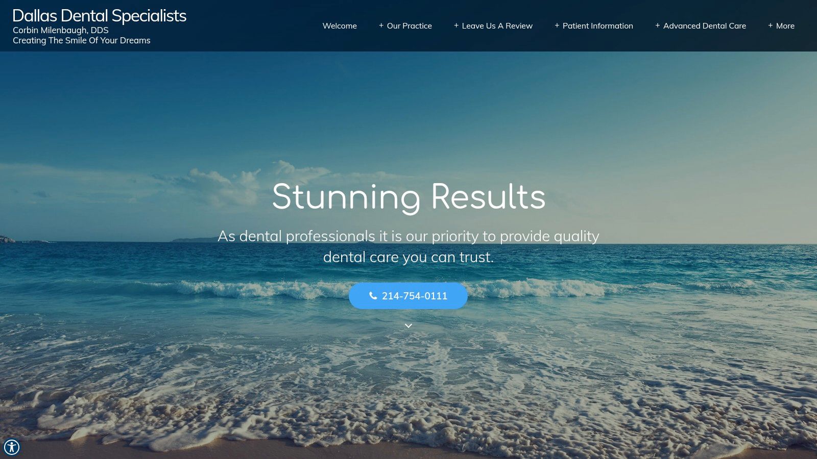
Black-and-gold branding gives Dallas Dental Specialists a more formal presentation than the family-oriented examples. Professional imagery, copy, and prominent testimonials make it a useful reference for practices considering a premium visual direction.
The palette is distinctive, but the more important question is what supports the impression. Patients need understandable evidence of expertise and a clear next step, not just an expensive-looking interface.
Put Trust Beside the Decision
Design: Use the dark palette selectively so treatment explanations and forms remain comfortable to read. A formal style can distinguish a practice while feeling less welcoming to some family or pediatric audiences.
Conversion: Place relevant testimonial content near treatment explanations and appointment prompts. Keep its source and context clear rather than presenting praise as proof of guaranteed outcomes.
- Local SEO/AEO: Connect the Dallas practice information to specific services and provider pages. For SEO for dental practices, visual differentiation supports credibility but doesn't establish search visibility.
- Content: Explain who provides care, what the consultation involves, and how patients can discuss insurance or payment before proceeding.
Testimonials help patients understand another person's experience. They don't establish what every patient will experience.
Urgent visitors also need a different route from routine patients. A dental website design review from WE highlights the importance of readable information and practical access details. Apply that principle with clearly separated routine-booking, urgent-contact, and after-hours instructions.
Don't imply immediate availability unless the practice can provide it. The visual presentation here is inspiration, not evidence of rankings, accessibility, or appointment results.
7. Peninsula Dentistry & Orthodontics
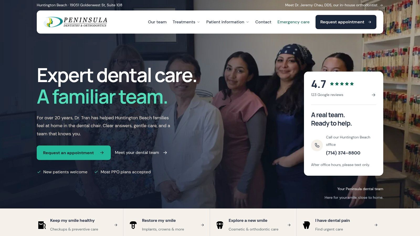
Peninsula Dentistry & Orthodontics in Huntington Beach, California, illustrates a more content-led approach. Agency-reported project details describe dedicated treatment pages, dentist credentials, practice history, testimonials, a before-and-after gallery, and insurance and financing information.
Treat those project descriptions and any outcome claims as agency-reported, not independently audited. The transferable idea is the relationship between service structure, trust, and patient questions.
Build Pages Around Treatment Decisions
- Design: Use repeatable treatment-page layouts so patients can compare options without learning a new interface each time.
- Conversion: Connect implants, veneers, Invisalign, orthodontics, and emergency-care content to an appropriate appointment path. Make in-house orthodontics visible as a practical differentiator.
- Local SEO/AEO: Describe genuine service coverage and office access. Avoid near-identical city pages that exist only to target additional searches.
- Content: Support treatment explanations with credentials, relevant gallery examples, payment guidance, and clear next steps.
Financial clarity deserves particular attention. GrowDent's dental website review identifies cost, insurance, and availability as concerns to address early. Build service-specific payment explanations rather than forcing every visitor to call for basic information.
If you publish cost ranges, include the assumptions and exclusions, and explain that final fees depend on an examination. Describe insurance verification without promising that a plan will cover treatment.
The trade-off is maintenance. Galleries, treatment descriptions, financing details, and service-area pages need named owners and regular review. A detailed website becomes less useful when patients can't tell whether its information is current.
7 Dental Website Examples at a Glance
| Practice | Standout Strength | Best For | Primary Conversion Action | Brand Style |
|---|---|---|---|---|
| Bowles Dental | Practical patient information and clear next steps | Family practices prioritizing patient questions and payment details | Book online or call/text | Patient-focused and informative |
| Swish Dental | Memorable branding with multi-location support | Practices serving several cities | Book an appointment or find a location | Relaxed and distinctive |
| Tend Dental | Consistent branding across location-specific pages | Multi-city dental groups | Book an appointment online | Contemporary and polished |
| Pearl Dental NYC | Specific, boutique positioning | Specialty or urban practices | Explore the practice and its services | Polished and urban |
| ATX Family Dentistry | Friendly visual identity for family care | Family practices seeking an approachable look | Explore the practice or contact the office | Colorful and playful |
| Dallas Dental Specialists | Distinctive palette and prominent testimonials | Practices seeking a formal, premium impression | Contact the practice | Formal and high-contrast |
| Peninsula Dentistry & Orthodontics | Treatment content paired with trust and local information | Practices highlighting multiple treatments and service areas | Explore treatments or contact the practice | Professional and trust-focused |
Turning These Dental Website Examples Into Your Own Lead Machine
The strongest lesson from these dental website examples isn't a color palette. It's alignment between what patients need to know and what you want them to do. Choose an obvious booking action, support it with a phone alternative, and explain whether visitors are scheduling directly or requesting an appointment.
Build dedicated service pages before expanding a generic blog. Each treatment page should explain the problem addressed, available options, provider expertise, payment considerations, and next step. Pair those pages with accurate location information and concise answers that search engines and answer engines can interpret, without assuming that formatting guarantees visibility.
Run This Site Audit This Week
- Test booking on mobile: Complete the journey yourself and confirm that staff receive the correct office, service, and contact information.
- Check treatment coverage: Make sure important services have useful pages, not just navigation labels.
- Review local details: Verify names, addresses, phone numbers, hours, directions, and office-specific services.
- Inspect hesitation points: Put credentials, contextual testimonials, insurance explanations, and payment guidance beside relevant decisions.
- Check accessibility: Test keyboard operation, form labels, text enlargement, image alternatives, and error messages.
- Measure completed actions: Separate booking starts, appointment requests, phone clicks, and confirmed appointments.
Use a reusable treatment-page template: patient concern, treatment explanation, suitability, process, provider credentials, relevant examples, payment guidance, and appointment action. For gallery organization, the cosmetic treatment examples from Ultra Smile DentalSpa offer another reference. Add explanatory context and don't imply identical outcomes.
If a rebuild feels bigger than an afternoon, a specialist team can coordinate design, writing, and ongoing optimization. At Digital Skyrocket, we build and SEO-optimize lead-generating service websites; our Burns Commercial Properties case study recorded a 239.29% increase in user engagement after its rebuild. That's a documented engagement result, not a dental-booking forecast.
Start by fixing the obstacle closest to booking. Then measure whether more qualified visitors become actual appointments.
Digital Skyrocket offers custom website design, content strategy, and ongoing local SEO and AEO for dental practices that need a new website and continued search optimization. Visit Digital Skyrocket to discuss a rebuild that connects treatment pages, patient questions, and clear appointment paths.