
High-intent buyers research several firms before making contact. Law-firm prospects commonly visit two to five websites, and 76% leave when a site lacks enough information, according to legal marketing statistics from MyCase. Professional-services websites need clear proof, focused service pages, and an immediate path to call, schedule, or submit an inquiry.
Polished visuals support credibility, but they cannot compensate for unclear offers or hidden next steps. Visitors comparing a law firm, dentist, roofer, consultant, or accounting firm assess risk, expertise, relevance, and responsiveness. The website must answer practical questions quickly: can this firm handle the problem, has it helped similar clients, and what happens after an inquiry?
Treat the site as an intake channel rather than a static profile. A website should help qualified visitors take action through calls, completed forms, scheduled consultations, and suitable inquiries. Page views provide context, but those actions show whether the redesign supports growth.

The brochure mindset creates avoidable friction
A brochure site usually has familiar symptoms:
- Generic positioning: “Solutions for every business” doesn't tell a specific buyer whether your firm understands their situation.
- Buried evidence: Testimonials, credentials, results, and relevant experience sit several clicks away from the service decision.
- Weak calls to action: “Learn more” appears everywhere, while phone, email, scheduling, or intake options remain difficult to find.
- Unclear process: Visitors don't know what happens after submitting a form, so contacting the firm feels like an unnecessary commitment.
- One-size-fits-all pages: A single services page forces different audiences to interpret which offering applies to them.
A lead-generation machine reverses those priorities. It gives each important audience a clear route from problem to proof to action. The homepage establishes relevance, service pages explain the fit, trust content reduces perceived risk, and intake tools make contact easy.
Practical rule: If a visitor has to hunt for your phone number, interpret your services, and guess what happens next, the site is asking them to sell themselves on your firm.
The strongest redesigns don't necessarily add more animation or more pages. They remove uncertainty. They explain the service in ordinary language, show credible evidence near the decision path, and make the preferred contact method obvious on every device.
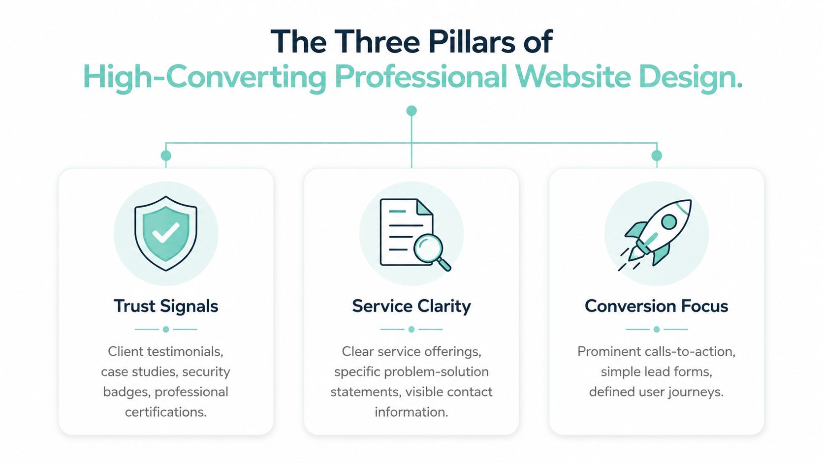
The Three Pillars of High-Converting Professional Website Design
A 2026 benchmark reports a 6.1% median landing-page conversion rate for commercial and professional services, with desktop visits converting at 11.6% and mobile visits at 8.3%, while 81% of visits occur on mobile, according to conversion-rate statistics from Landbase. Those conditions make every point of hesitation during intake consequential. A high-converting professional-services site connects trust signals, service clarity, and frictionless intake so visitors can assess fit and contact the firm without unnecessary effort.
Trust signals belong near the decision
Trust signals include client testimonials, case studies, professional certifications, memberships, awards, relevant experience, and identifiable team profiles. Placement matters as much as presence. A testimonial hidden on a separate page cannot reassure someone deciding whether to complete an inquiry form on a service page.
Put proof beside the point of doubt. A personal-injury page might place relevant experience and client feedback beside the consultation call to action. A roofing page could show project photographs, warranties, service areas, and a straightforward inspection process near the request form. A consulting firm can connect an expert bio with relevant insights and project outcomes.
Specific evidence builds confidence. Claims that exceed the evidence create skepticism, especially for visitors comparing several firms.
Service clarity turns expertise into relevance
Each core service should answer four questions quickly:
- Who is this for?
- What problem does it address?
- How does the firm help?
- What should the visitor do next?
A service page should use the client's situation and desired outcome rather than internal terminology. Explain the process with enough detail to make the next conversation feel safe. One audience problem paired with one primary outcome usually gives a page more direction than a long list of disconnected capabilities.
Frictionless intake respects mobile behavior
The contact path should reflect the visitor's context. Use click-to-call phone numbers, short forms with labeled fields, visible email options, scheduling where appropriate, and clear confirmation messages. Give visitors more than one practical route. Someone ready to call should see the number immediately, while someone who prefers email should not face a long questionnaire.
Responsive layouts, fast pages, readable forms, and prominent contact paths are conversion infrastructure, not optional technical details. A professional website should make the next action obvious without turning every high-intent visitor into the same intake workflow.
Technical Performance and Local SEO Foundations
A polished interface can't compensate for slow rendering, unstable layouts, or weak local discovery signals. Technical execution determines whether a potential client can see the page, understand it, and interact with it before losing patience.
Google's Core Web Vitals provide a useful performance baseline. The “good” thresholds are Largest Contentful Paint at 2.5 seconds or less, Interaction to Next Paint at 200 milliseconds or less, and Cumulative Layout Shift at 0.1 or less, as defined in Google's Core Web Vitals documentation. A page passes only when all three metrics meet the threshold at the 75th percentile of real user sessions over a rolling 28-day window.
Performance is part of lead volume
Heavy homepage video, oversized photographs, unnecessary scripts, and unstable consent or chat widgets create problems at the exact moment a visitor decides whether to continue. Aggregated performance data associates 2 to 3 second loads with a 32% bounce-rate increase and about a 7% conversion decrease, while 3 to 5 second loads correlate with about a 90% bounce-rate increase and 15% lower conversions, according to Core Web Vitals performance statistics.
Mobile users are especially unforgiving. 53% leave when a site takes more than three seconds to load, according to 2026 website-speed statistics. Compress images, reserve space for dynamic elements, reduce third-party scripts, and test real templates rather than relying only on a desktop preview.
Typography also affects perceived speed and comprehension. A deliberate typography hierarchy for every screen helps visitors scan headings, supporting copy, and calls to action without turning the page into a dense wall of text.
Local SEO starts with usable architecture
Local discovery depends on more than inserting a city name into a footer. Build distinct location and service relationships, maintain consistent business information, connect the site to the firm's local presence, and make service areas understandable to both people and search systems. Avoid thin location pages that repeat the same copy with a different place name.
Mobile-first architecture matters because 73% of local searches start on a mobile device, and 52% of consumers began their most recent local search on Google, with 71% using Google Search during the journey, according to BrightLocal's local SEO statistics. Keep navigation reachable, phone links functional, forms comfortable to complete, and essential information visible without excessive scrolling.
For implementation, review the 10-point on-page SEO checklist alongside performance and conversion requirements. Search visibility is valuable only when the resulting visitor can move from answer to relevant page to inquiry.
Essential Pages and Content Architecture for Service Firms
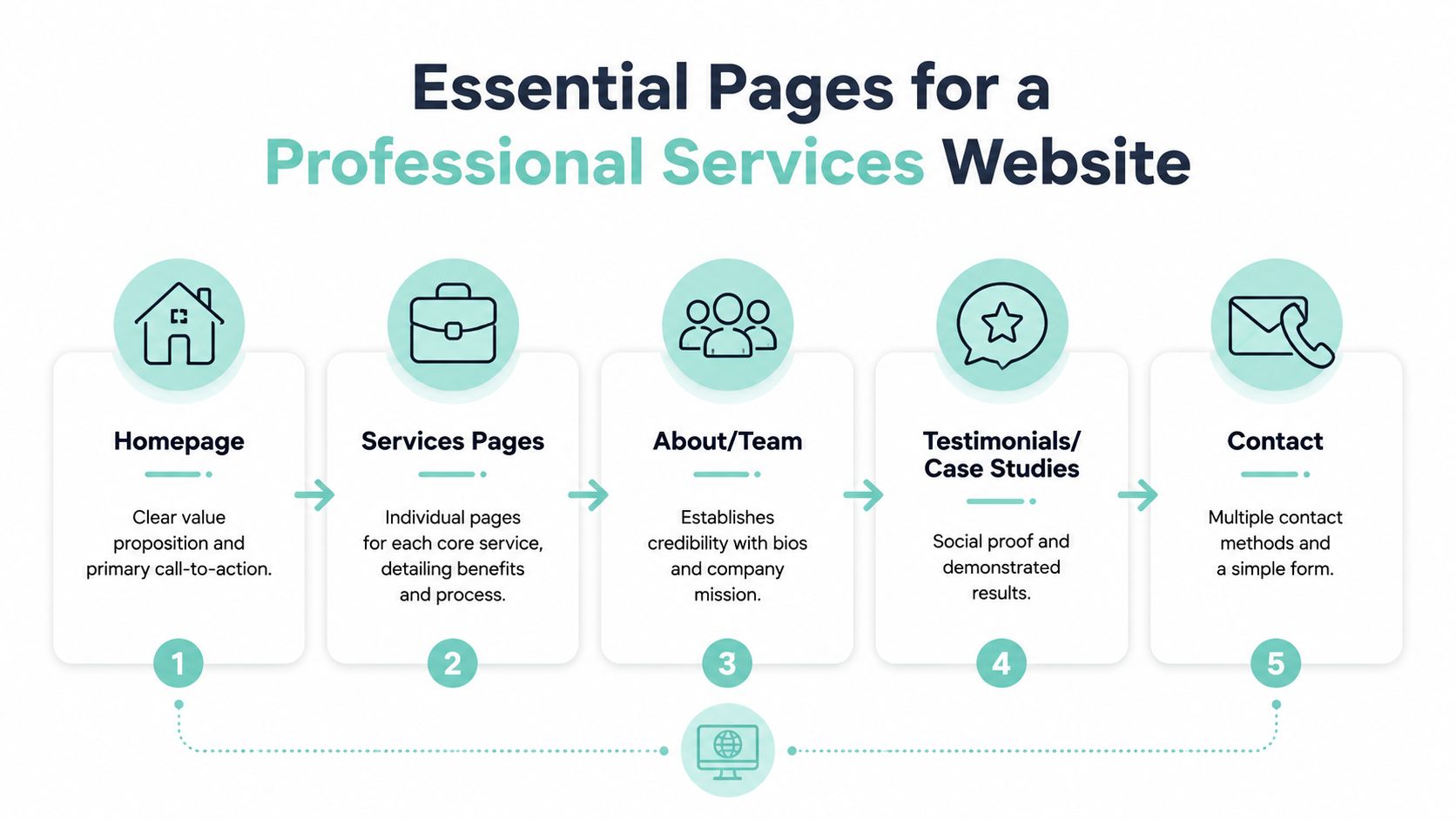
A service firm's website should guide a buyer from initial fit check to a qualified inquiry. The homepage identifies the audience, problem, service, and next action. Dedicated service pages address specific needs. About and team content make the firm recognizable, while testimonials and case studies provide evidence. Contact tools turn interest into an intake event.
Build the core route first
The homepage should state who the firm serves, what problem it handles, and what visitors should do next. Avoid vague positioning that makes people interpret the branding. Direct different audiences to the relevant service or location instead of giving every offering equal prominence.
Service pages deserve the most strategic attention. Give each important service its own page when its audience, search intent, process, or proof differs. Explain what the service includes, who benefits, how the engagement works, why the firm is qualified, and how to begin.
An emergency roof repair page should emphasize speed, availability, and immediate next steps, while a commercial roofing page should highlight project history, warranties, and scheduling flexibility. Estate planning and personal injury pages require the same level of separation because visitors arrive with different concerns and decision criteria.
The About page should explain the firm's point of view, people, relevant experience, working style, and expectations. Visitors assessing a serious matter want to know who will handle it and what the relationship will feel like.
Make proof and contact part of the architecture
Link testimonials and case studies from related service pages, where proof can answer objections at the right moment. A useful case study covers the client context, challenge, approach, and outcome without exposing confidential information. If measurable results cannot be disclosed, describe the practical change without manufacturing precision.
The contact page can offer several routes, but each needs a clear purpose. Include a short form, phone number, email address, scheduling option, office details, and a concise explanation of what happens after submission. Repeat the primary action on service pages so visitors do not have to return to the main navigation.
Map page relationships with this sample sitemap for a website as a planning reference.
Structure content for answer engines
Answer engine optimization requires explicit question-and-answer relationships. Place a concise answer near the top of the page, then expand with process details, qualifications, limitations, and next steps. Write headings around natural-language queries such as who the service suits, how long the process takes, and what happens after an inquiry.
Use clearly labeled question-and-answer blocks, and add FAQ schema when the visible page content supports it. Keep each answer focused on one question. Lists can clarify steps, requirements, or eligibility, while internal links should point readers to the service, proof, or contact page that resolves the next decision.
This structure helps visitors scan and gives search systems clearer relationships between queries and answers. It also gives every page a defined job, reducing competition among the firm's own content.
Timeline, Investment, and What to Expect From a Redesign
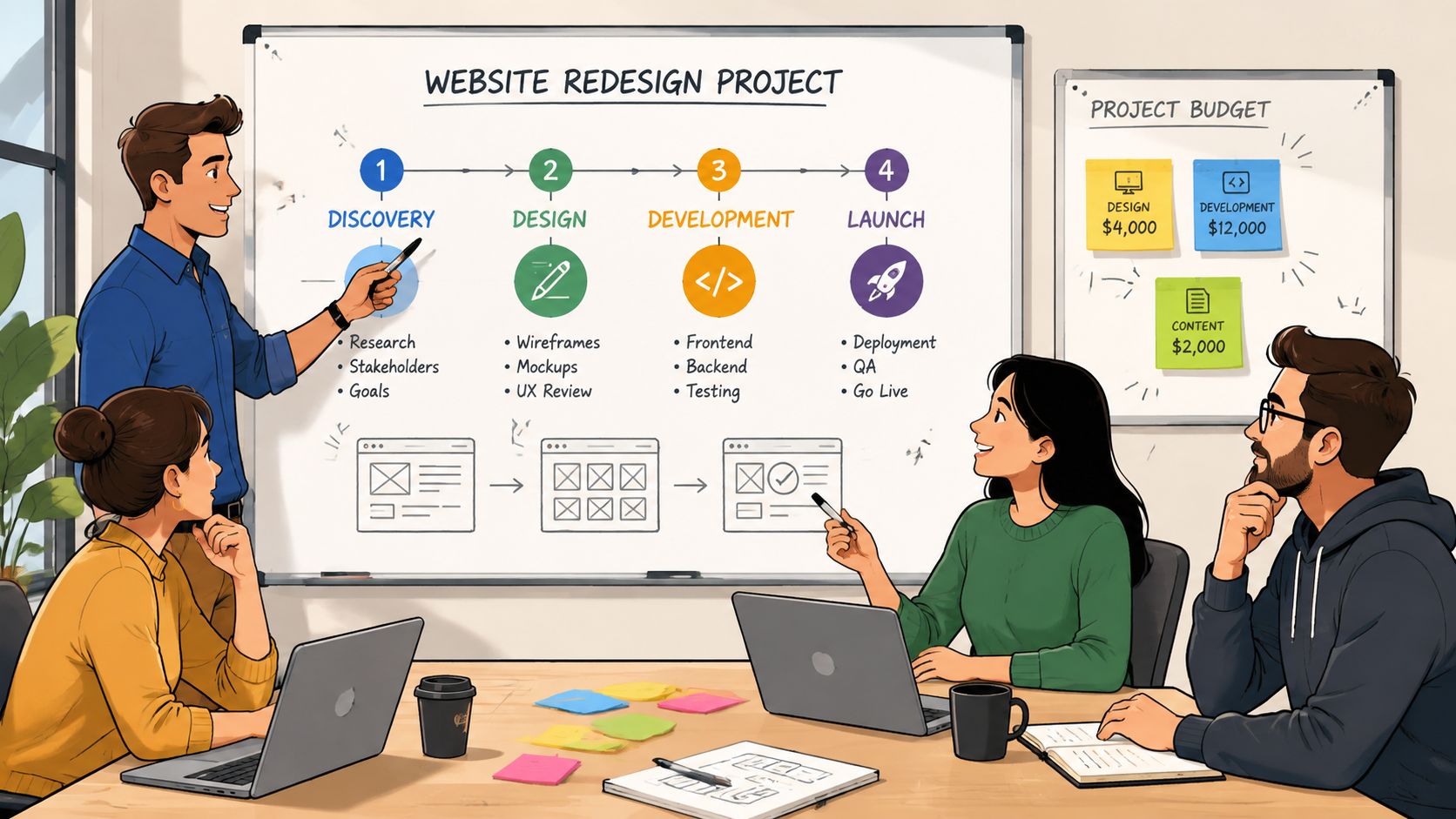
A strategic redesign is a sequence of decisions, not a cosmetic production sprint. The work usually moves through discovery, content and search planning, information architecture, design, development, testing, launch, and ongoing improvement. Each phase affects the next, so rushing early strategy often creates expensive revisions later.
During discovery, the team should understand business goals, profitable services, audiences, existing rankings, current inquiries, competitors, and operational capacity. Content planning then defines the page hierarchy and messaging. Design translates those decisions into responsive layouts, while development handles WordPress implementation, integrations, analytics, accessibility, and performance.
Evaluate the investment by scope
Two proposals can show similar page counts while covering very different work. Ask whether the scope includes:
- Research: Audience, service, competitor, and search-intent analysis.
- Content: Copywriting, editing, migration, subject-matter interviews, and approval cycles.
- Design: Custom layouts, responsive states, accessibility considerations, and reusable components.
- Development: CMS setup, forms, scheduling, analytics, redirects, integrations, and quality assurance.
- Optimization: Performance testing, metadata, structured content, local SEO foundations, and conversion review.
- Support: Hosting coordination, maintenance, reporting, SEO work, and post-launch refinements.
The recurring costs matter too. Hosting, software, maintenance, content updates, SEO, analytics review, and conversion testing keep the site useful after launch. A one-time build can create a solid foundation, but rankings and intake performance require ongoing attention as services, competitors, search behavior, and business priorities change.
A low design fee isn't a bargain if it excludes the strategy, content, technical work, and post-launch iteration that generate the result.
Before approving a proposal, identify who owns the content, who supplies photography, how feedback is collected, what happens to existing URLs, and how the team will report qualified inquiries. Those details reveal whether you're buying a finished interface or building a functioning acquisition asset.
How to Choose a Web Design Partner for Lead Generation
Choose the partner that can connect design decisions to business outcomes. A generalist may produce a competent visual system, but professional-services lead generation requires additional discipline around local search, service-page architecture, intake workflows, accessibility, performance, and reporting.
Ask candidates to explain how they would handle a slow mobile homepage, a service page with strong traffic but few inquiries, and a firm whose visitors compare several competitors before calling. Their answers should include investigation and measurement, not just a promise to make the site modern.
Compare partners by operating model
A general-purpose provider often emphasizes:
- Visual delivery: Attractive mockups and a familiar template system.
- Project completion: A launch date and a fixed list of pages.
- Broad capability: Design work for many industries and business types.
- Basic reporting: Traffic or ranking summaries without a clear lead connection.
A lead-generation specialist should be able to discuss:
- Conversion paths: Where visitors go from search result to service page to contact.
- Technical constraints: Core Web Vitals, mobile usability, form reliability, and script weight.
- Search architecture: Service, audience, and location relationships that support intent.
- Evidence placement: Which proof appears near each decision point and why.
- Measurement: Calls, forms, scheduling events, rankings, organic traffic, and qualified inquiries.
- Iteration: How post-launch behavior changes the next design or content decision.
If you're comparing ongoing creative support, a guide to compare graphic design subscriptions can help clarify what subscription design models include. That comparison is separate from selecting a partner responsible for website strategy, search visibility, and conversion performance.
Use this guide to choosing a web design agency to structure interviews and proposal reviews. Digital Skyrocket is one option for service companies that need custom website design, local SEO, answer engine optimization, performance work, analytics, and conversion improvements tied to calls, emails, and forms. The right partner won't promise a quick visual fix. They'll show how the site will earn attention, establish trust, reduce friction, and make the next conversation easier.
Digital Skyrocket plans and builds lead-generating websites for law firms, dentists, roofers, HVAC companies, and other service businesses, combining custom WordPress design with local SEO, AEO, and ongoing conversion improvements. Visit Digital Skyrocket to discuss a website redesign built around qualified inquiries rather than brochure-style page views.