

A roofing owner watches the analytics dashboard climb after a costly redesign, yet the phone stays quiet. The homepage looks sharper, the pages load with polished photography, and the agency reports stronger engagement. But visitors still can't tell whether to call, request an inspection, or keep searching.
That gap is the difference between a site that presents a business and one that converts intent into qualified inquiries. Mobile search, local packs, and AI answer engines now send people to pages with specific needs. They expect an immediate answer, credible proof, and an obvious next step.
Table of Contents
- Why Pretty Sites Stop Producing Inquiries
- What Conversion Focused Web Design Actually Means
- The Discovery to Launch Workflow for Service Sites
- Speed, Mobile, and Core Web Vitals as Revenue Mechanics
- Law Firm, Roofer, and Multi-Location Snapshots
- KPIs, Tools, and a Pre-Launch Checklist
- What to Do This Quarter to Lift Qualified Leads
Why Pretty Sites Stop Producing Inquiries
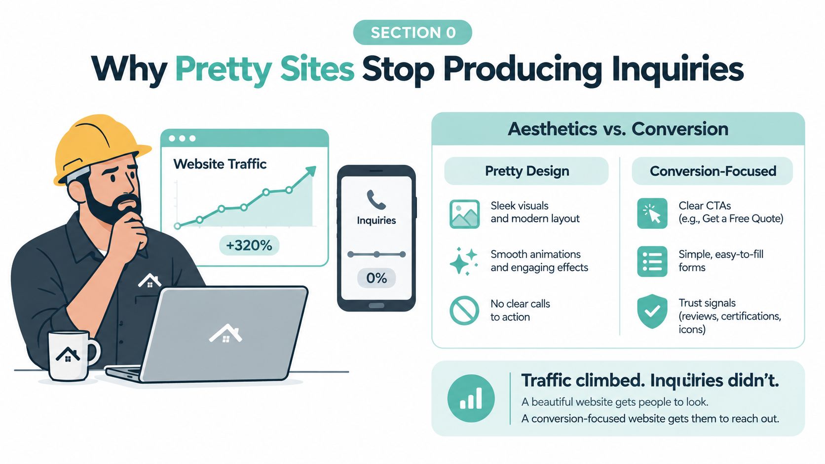
The roofing owner's problem isn't unusual. A site can win design awards while hiding the phone number in a desktop navigation bar, using a headline such as “Built for What's Next,” and placing the quote form beneath several screens of brand storytelling. On mobile, a visitor may have to pinch, scroll, dismiss a chat window, and search for a service area before finding a way to ask for help.
The failure usually isn't visual quality. It's the missing connection between what a visitor sees and what the business needs that visitor to do. A law firm may need a qualified consultation, a roofer may need an inspection request, and a multi-location operator may need a location-specific call. If the page gives all three actions equal weight, it gives none of them enough direction.
The brochure problem
Brochure-style websites organize information around the company. Conversion-focused sites organize information around the visitor's intent and the next useful action.
A visitor arriving from a local pack listing may already be comparing providers nearby. Someone reaching a DUI attorney page from mobile search may want immediate contact, not a history of the firm. A person asking an AI answer engine about roof replacement needs a page that clearly explains service scope, location, process, and proof.
Industry benchmark summaries place average website conversion at about 2.35%, while top-performing pages can reach 11% or higher, creating a fourfold to fivefold gap between average and elite experiences, as summarized by conversion rate optimization benchmarks. Those figures don't promise a result for any particular business, but they show why layout, copy, forms, and trust placement deserve commercial attention.
Practical rule: If a visitor has to interpret the page before finding the next step, the design is making the visitor do sales work.
Intent arrives through several doors
Mobile search creates urgency and limited attention. Local packs create comparison behavior. AI answer engines create a new referral experience in which a visitor may arrive after receiving a concise explanation and wanting confirmation, evidence, or contact.
That means an attractive homepage can't carry the entire funnel. Service businesses need focused pages that answer the searcher's question, establish relevance, show credible proof, and make the preferred action easy to complete.
What Conversion Focused Web Design Actually Means
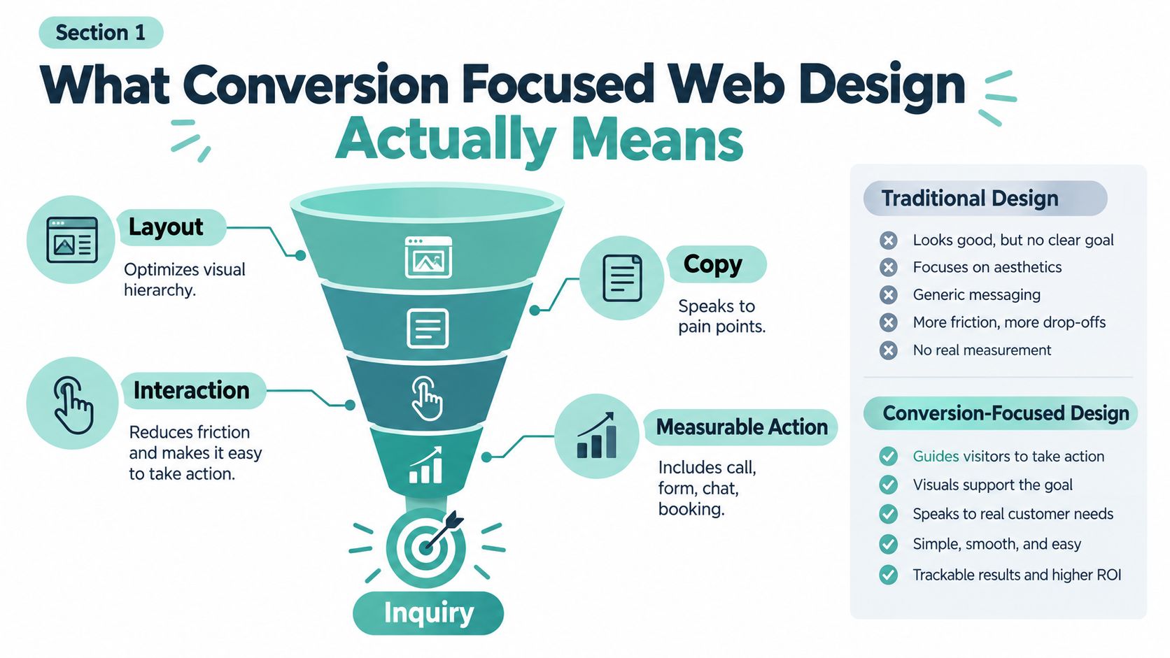
Conversion focused web design treats layout, copy, and interaction as connected decisions that move a visitor toward a measurable action. That action might be a phone call, form submission, chat, booking, or consultation request. The design isn't judged only by whether it looks consistent. It's judged by whether qualified visitors can understand the offer and act without unnecessary hesitation.
Brochure design has a different center of gravity. It may prioritize brand expression, complete navigation, and visual differentiation. Those elements matter, but they don't answer the operational questions a service business must solve: Which service brought the visitor here? What evidence addresses the visitor's concern? What should happen next?
Five principles make the discipline practical
Match the page to intent. A personal injury page should speak to the visitor's situation and explain the contact path. A roof replacement page should focus on scope, condition, process, and the estimate request. A location page should prove local relevance instead of repeating a generic service paragraph.
Give each section a primary job. A hero can direct the visitor to call or request an estimate. A proof section can reduce doubt. A process section can explain what happens after the form. Multiple secondary links may exist, but the visual hierarchy should make the preferred action unmistakable.
Place trust near decisions. Reviews, credentials, service-area proof, project examples, attorney profiles, warranties, and response expectations work best beside the question they answer. A testimonial buried on a separate page can't reassure someone who is deciding whether to submit an intake form.
Map friction before styling. Count the steps between a search result and a completed inquiry. Check whether phone numbers are tappable, whether forms work with a thumb, whether error messages explain the fix, and whether the CRM receives the submission correctly.
Sequence decision-stage content. Start with relevance, then establish value, address objections, demonstrate proof, and present the action again. The sequence should reflect how a real prospect decides, not how an internal team wants to describe the company.
For teams refining landing pages, effective landing page strategies can provide useful perspective on aligning page structure with the questions a buyer needs answered. The same principle applies to service businesses, even when the conversion is a call rather than a purchase.
It isn't a template
A DUI page, emergency roofing page, and location page shouldn't share identical messaging because they use the same CMS. The right structure depends on traffic source, service line, geography, urgency, and funnel stage. Conversion focused web design is therefore a process of matching page decisions to commercial intent, then validating those decisions with behavior and lead data.
The Discovery to Launch Workflow for Service Sites
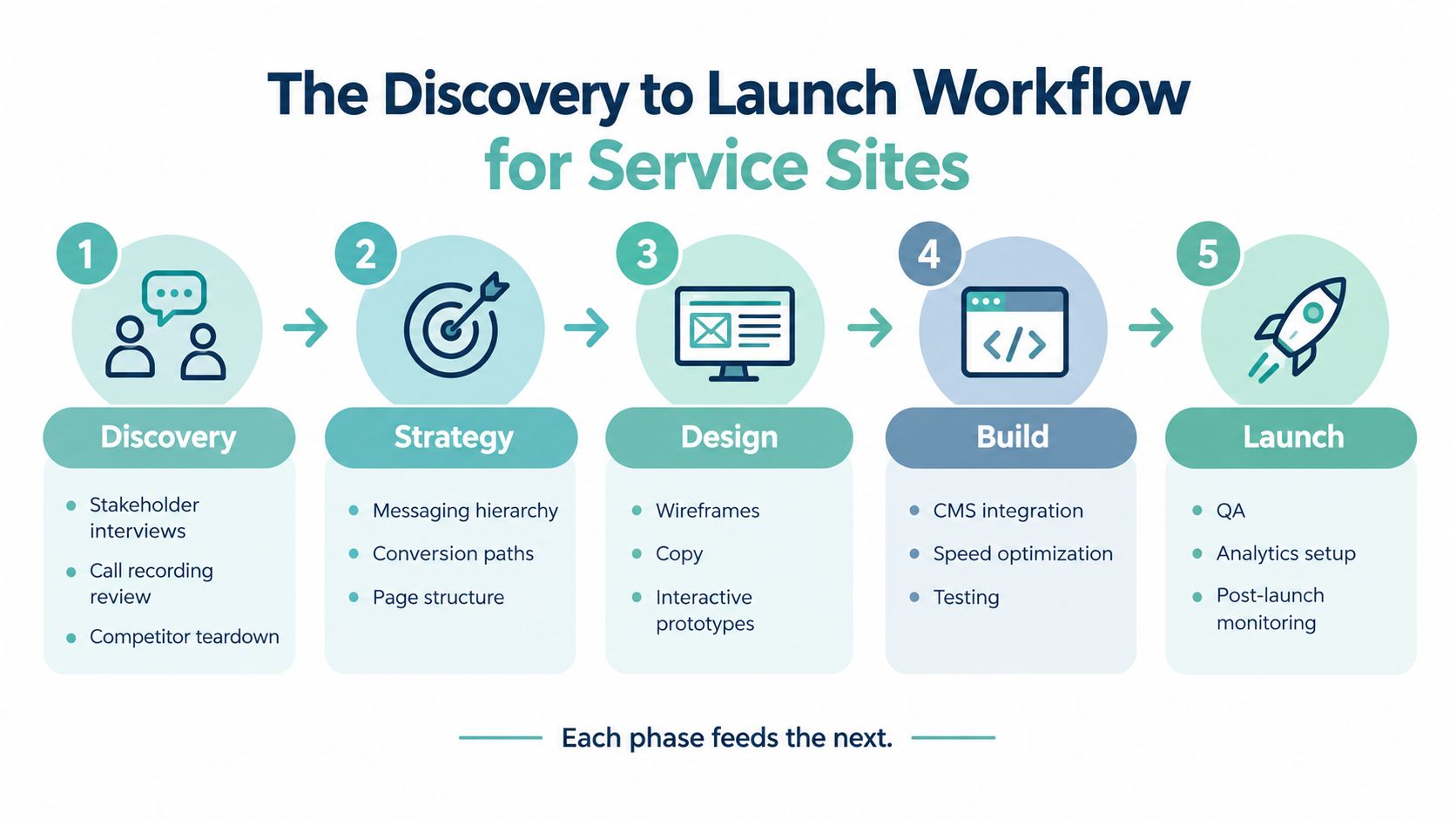
A lead-generating site is built through connected phases. Skipping one usually creates a later problem that looks like a design issue but began with strategy or measurement.
Discovery creates the commercial brief
Start with stakeholder interviews, recorded call reviews, sales-team questions, and a competitor teardown. Listen for the language prospects use when they describe urgency, price concerns, eligibility, damage, location, or uncertainty. Then write a conversion hypothesis tied to business value, such as: “Visitors reaching the emergency repair page need a fast call path and clear response expectations.”
This phase should also identify which leads are qualified. A form submission without service fit, location fit, or a workable case may inflate reporting while disappointing the owner.
SEO and AEO shape the page system
Map keywords by service line and location rather than forcing every query onto the homepage. Build service pages, location pages, supporting educational content, and internal links that guide authority toward revenue-producing pages.
Use service and review schema where appropriate, validate the implementation, and create FAQ blocks that answer genuine customer questions in extractable language. AI answer engines need clear entities, service definitions, geographic context, and supporting evidence. The page must remain useful to humans, not become a collection of robotic answers.
Design begins with wireframes
Create wireframes around CTA placement, information hierarchy, and trust signals before investing in visual polish. A mobile-first layout should show the service, location, proof, and action without forcing the visitor through decorative movement or oversized media.
The design team should prototype the actual interaction. Test the tap-to-call control, form behavior, sticky mobile action, navigation, and confirmation state. A static desktop composition can't reveal whether a thumb can use the page comfortably.
CRO and reporting keep the system honest
After launch, use heatmaps, session recordings, and controlled tests to examine hero copy, form length, page order, and phone CTA prominence. Instrument every meaningful CTA in GA4 and connect call tracking to source and landing page data.
Review performance weekly during the first 90 days, then separate channel issues from page issues. Service businesses often stall by launching without call tracking, treating SEO and design as separate projects, or reporting traffic without measuring qualified inquiries.
The launch isn't complete when the site is published. It's complete when the business can trace an inquiry from source to outcome.
Speed, Mobile, and Core Web Vitals as Revenue Mechanics
A Lighthouse score is useful for diagnosis, but an owner cares about whether a mobile visitor reaches the form or taps the phone number. Deloitte's research found that a 0.1-second mobile speed improvement correlated with an 8.4% lift in retail conversions and a 10.1% lift in travel conversions, along with changes in average order value, as reported in Deloitte's mobile speed research. Service businesses should treat that relationship as a reason to investigate performance, not as a guaranteed lift for every industry.
Google's Core Web Vitals provide concrete engineering targets:
- LCP: Keep the largest visible content element at 2.5 seconds or less.
- INP: Keep interaction response at 200 milliseconds or less.
- CLS: Keep layout shift at 0.1 or less.
These thresholds affect common service interactions. A slow hero image delays the offer and CTA. A heavy chat widget can interfere with a form tap. A shifting review carousel can move the button just as someone tries to press it.
The mobile page is the phone-call decision
Google's mobile research found that as load time rises from one second to ten seconds, the probability of a mobile bounce increases by 123%, and page element count was the strongest predictor of conversions, according to Google's mobile page-speed benchmarks. That makes page weight and complexity central conversion decisions.
Remove uncompressed home-page hero images, defer noncritical JavaScript, reduce third-party scripts, and avoid bloated templated location pages. Use responsive image sizing and test real production templates, not only a clean staging page.
Mobile conversion has historically lagged desktop. One broad benchmark summary reports 4.14% desktop conversion versus 1.53% mobile, while another ecommerce summary reports 3.7% on desktop and 2.2% on phones, as shown in HubSpot's mobile optimization summary. The exact benchmark varies by audience and measurement method, but the design implication is consistent: responsive behavior, thumb reach, concise forms, and click-to-call placement deserve first-class attention.
For implementation help, review website speed optimization services as part of a broader technical and conversion audit. The goal isn't a prettier report. It's more completed forms, more qualified calls, and fewer abandoned interactions.
Law Firm, Roofer, and Multi-Location Snapshots
The following are anonymized composite vignettes, not claims about named clients. They show how the same conversion principles change depending on the lead channel and the decision a visitor needs to make.
Personal injury firm
The firm's practice-area pages had strong credentials but weak intake hierarchy. The redesign placed case-specific trust signals near the contact path, clarified who the firm serves, reduced competing navigation choices, and made click-to-call prominent on mobile.
The primary channel was local and organic search, with some visitors arriving after an AI answer engine had summarized a legal issue. The design trade-off was less room for broad firm branding on the first screen, in exchange for faster reassurance and a clearer consultation path. Qualified consultation volume improved after the redesign, but the important operational change was the ability to distinguish general inquiries from viable intake.
Regional roofing company
The roofing site relied on a stock template that treated every service and city alike. The new architecture paired services with locations, used project galleries as local proof, and added emergency response modules for urgent searches.
Those changes affected organic search, local pack visitors, and paid landing-page traffic managed by an outside partner. The business could see which sources produced inspection requests rather than assuming all traffic had equal value. The trade-off was production effort. Unique location evidence takes more work than duplicating a paragraph, but generic pages rarely answer the local questions that influence trust.
For a practical example of the service-specific architecture involved, see web design for roofers.
Multi-location operator
The operator had fragmented local sites with inconsistent business information and uneven page quality. The rebuild consolidated the architecture, preserved unique location data, standardized name, address, and phone details, and applied local schema carefully.
The affected channel was local discovery, especially map pack visibility and location-driven organic visits. AI answer engines also had clearer location entities to interpret. The trade-off was governance. A scalable system needs ownership for updating hours, services, staff, reviews, and local proof, or the centralized structure becomes stale.
| Vertical | Key design change | Channel affected | Qualified inquiry shift |
|---|---|---|---|
| Personal injury law | Practice-area trust signals, intake qualification, click-to-call hierarchy | Organic, local search, AI referrals | More consultations could be separated from general inquiries |
| Roofing | Service and location pairs, local project proof, emergency modules | Organic, local pack, paid landing pages | Inspection sources became easier to identify |
| Multi-location operator | Consolidated architecture, unique location data, local schema | Local pack, organic, AI referrals | Location-driven inquiries became easier to attribute |
The repeating pattern is simple: the page must reflect the visitor's reason for arriving. The exact proof, form, and CTA hierarchy will differ by vertical.
KPIs, Tools, and a Pre-Launch Checklist
A service-business dashboard should connect visitor behavior to pipeline, not stop at sessions and page views. Track qualified form submissions, phone calls lasting over 60 seconds, booked consultations, cost per qualified lead by channel, assisted conversions, and pipeline value from web-sourced cases or jobs.
Use a manageable stack:
- GA4: Configure event-based conversions for forms, calls, booking starts, and completed bookings.
- Call tracking: Preserve source, campaign, landing page, and call outcome where the system supports it.
- Heatmaps and replay: Review hesitation, rage clicks, dead zones, and mobile form behavior.
- A/B testing: Test one meaningful variable at a time, such as hero language, form length, or phone CTA prominence.
- Weekly reporting: Compare qualified outcomes with the prior baseline and document the next action.
A small team can delegate repetitive dashboard checks or data cleanup to a trusted resource. For operational support, hire a virtual assistant when the task is clearly documented and doesn't require strategic judgment.
For deeper measurement planning, use this guide to Google Analytics for website visitors alongside your conversion definitions.
Pre-launch checks
- Redirect mapping: Match old URLs to relevant new destinations and test priority redirects.
- Schema validation: Check service, organization, review, and local markup for accuracy.
- Index coverage: Confirm important pages are crawlable, canonicalized, and eligible for indexing.
- Production performance: Test Core Web Vitals on real templates, especially mobile service and location pages.
- Form delivery: Submit forms on real devices and verify CRM receipt, notifications, attribution, and confirmation messaging.
- Measurement plan: Record the baseline and define a 30-day post-launch comparison.
If traffic drops while leads remain flat, check redirects, indexing, and tracking before changing the design. If traffic holds but inquiries fall, inspect form delivery, CTA visibility, page intent, and call tracking. If submissions rise but qualified leads don't, tighten qualification and compare landing-page messaging with the actual sales conversation.
What to Do This Quarter to Lift Qualified Leads
Start Monday by fixing attribution. Assign one owner to verify GA4 events, call-source data, CRM delivery, and qualified-lead definitions. The deliverable is a clean baseline for form completion, qualified calls, and booked consultations.
Next, audit the top ten landing pages by inquiry opportunity. For each page, record the service intent, location relevance, primary CTA, trust evidence, mobile experience, internal links, FAQ coverage, and Core Web Vitals status. Have SEO, sales, and operations review the same document so the page reflects both search demand and lead quality.
Then schedule one focused redesign sprint around the service line that produces the most revenue. Assign a strategist to the conversion hypothesis, a writer to the page copy, a designer to the mobile wireframe, and a developer to speed and tracking. Choose a number to move, such as form completion rate, qualified call volume, or local pack impressions, and review it weekly.
A quarter of disciplined work on the right pages will usually teach you more than scattered visual tweaks across the entire site. Design decisions without channel and conversion data are guesses.
Digital Skyrocket plans and builds lead-generating websites with responsive WordPress development, technical SEO and AEO, analytics instrumentation, form tracking, and ongoing conversion refinement for service businesses. Visit Digital Skyrocket to discuss a website and search strategy built around qualified inquiries, not just attractive traffic.