
You're probably in one of two situations right now. Either your firm already paid for a polished website and it still isn't producing enough qualified case inquiries, or you know your current site looks dated and you're trying to avoid spending money twice.
That tension is normal. Personal injury firms don't need a prettier brochure. They need a site that earns trust fast, ranks in local search, answers urgent legal questions clearly, and moves visitors toward a call or consultation request without friction.
The firms that win online don't separate design, search visibility, and intake strategy. They build all three together. That matters even more now because search behavior is changing. Google still matters, but potential clients are also getting AI summaries, direct answers, and local recommendations before they ever click a blue link. If your site isn't structured for that reality, you're already behind.
Table of Contents
- Your Website Is More Than a Digital Brochure
- Anatomy of a High-Converting PI Lawyer Website
- Driving Targeted Traffic with SEO and AEO
- Turning Visitors into Qualified Leads with CRO
- Common Website Design Pitfalls That Kill Cases
- The Agency Process From Discovery to Launch
- Frequently Asked Questions About Law Firm Web Design
Your Website Is More Than a Digital Brochure
A surprising number of firms treat the website like a digital business card. It lists practice areas, shows a few attorney photos, adds a contact form, and then everyone wonders why signed cases don't increase.
That approach doesn't work anymore because almost every competitor is already online. Industry data indicates that 94% of law firms currently possess a website, leaving only 6% without an online presence. This near-universal adoption means the competitive battleground has shifted from merely having a site to having one that outperforms others in search visibility and client conversion according to Spinx Digital's write-up on personal injury lawyer website design.
If nearly every firm has a website, then your advantage won't come from existence. It comes from execution.
What partners often miss
A personal injury website has to do several jobs at once:
- Build confidence quickly: Visitors need to feel they're dealing with a serious, competent firm.
- Answer immediate questions: They want to know whether you handle their case type, where you work, and what to do next.
- Support search visibility: Google and AI systems have to understand what the page is about.
- Move the intake forward: Phone calls, short forms, click-to-call, and clear next steps have to be obvious.
A brochure site usually fails on the last three.
Practical rule: If your homepage looks good in a boardroom but doesn't guide an anxious injured person toward action, it's underperforming.
The business lens is simple. Your site isn't there to impress other lawyers. It's there to turn searchers and referrals into consultations. Good design supports that goal. It isn't the goal by itself.
Anatomy of a High-Converting PI Lawyer Website
The best personal injury lawyer website design feels composed, clear, and human. It doesn't look busy, and it doesn't feel generic. It gives the visitor confidence before they read much at all.
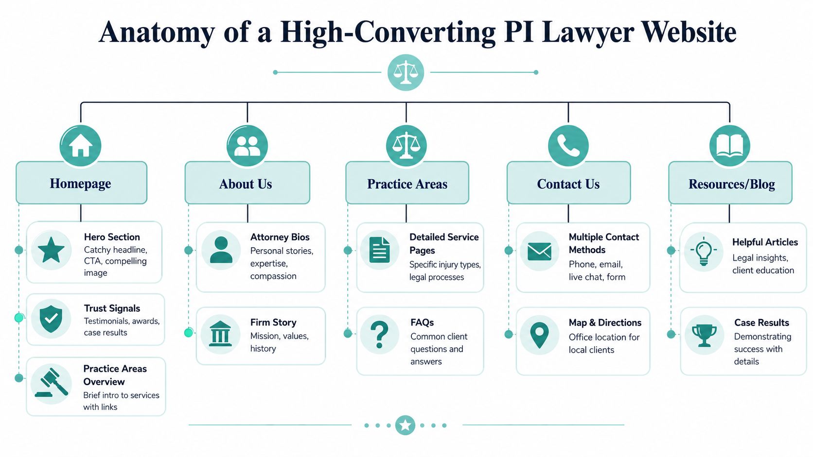
Design for credibility
The homepage hero is your digital handshake. If it uses weak stock art, cluttered typography, or a vague slogan, the relationship starts badly.
Visual trust usually comes from three things working together:
| Element | What works | What fails |
|---|---|---|
| Photography | Real attorneys, staff, office details, community context | Generic gavels, handshakes, courthouse stock images |
| Layout | Clear hierarchy, readable spacing, obvious calls to action | Crowded modules, sliders, competing buttons |
| Brand tone | Calm authority, empathy, specificity | Hype, chest-thumping, vague claims |
A useful benchmark comes from a study of 100 top-ranked personal injury law firm websites, which found that the average number of large images per landing page is four. That's a practical clue. Strong firms usually use several meaningful visuals to break up text and humanize the experience, but they stop before the page turns into a gallery.
Professional photography matters more than many firms expect. If your team photos look inconsistent, outdated, or low effort, visitors notice. This is why it helps to review examples of professional headshots for law firms before a redesign. The goal isn't vanity. It's visual consistency that signals competence.
User experience for clarity
User experience in PI isn't about novelty. It's about reducing uncertainty.
Navigation should help a visitor answer a short list of questions fast:
- Do you handle my case type?
- Do you serve my area?
- Can I trust this firm?
- How do I contact you right now?
That means clean menus, scannable headings, and practice area pages that explain legal help in plain English. It also means no burying the phone number and no forcing people to hunt for the contact page.
A strong PI website doesn't make visitors think harder. It makes the next step obvious.
Trust signals belong near decision points, not hidden on isolated pages. Case results, attorney bios, testimonials, awards, and FAQs all work better when they support a call to action instead of living in separate silos.
For firms that want design and search strategy to work together, this overview of SEO web design for lawyers shows why structure matters as much as aesthetics.
Mobile-first architecture that respects urgency
A lot of injury-related searches happen in stressful moments. Someone may be in a body shop, an ER parking lot, or at home after talking with an insurer. On mobile, patience is low and attention is fragmented.
So the mobile version can't be a squeezed-down desktop layout. It needs:
- Thumb-friendly buttons: Large enough to tap without frustration
- Simple forms: Fewer fields, less cognitive load
- Sticky contact access: Call buttons and contact options available without hunting
- Readable spacing: Short sections, legible type, clean contrast
The best mobile sites feel almost obvious. That's the point. They reduce effort at exactly the moment the user has the least capacity to tolerate it.
Driving Targeted Traffic with SEO and AEO
A partner approves a website redesign, the new site looks polished, and six months later intake has not improved. I see this when firms treat traffic as a content problem instead of a design and infrastructure problem. Search visibility starts in the build.
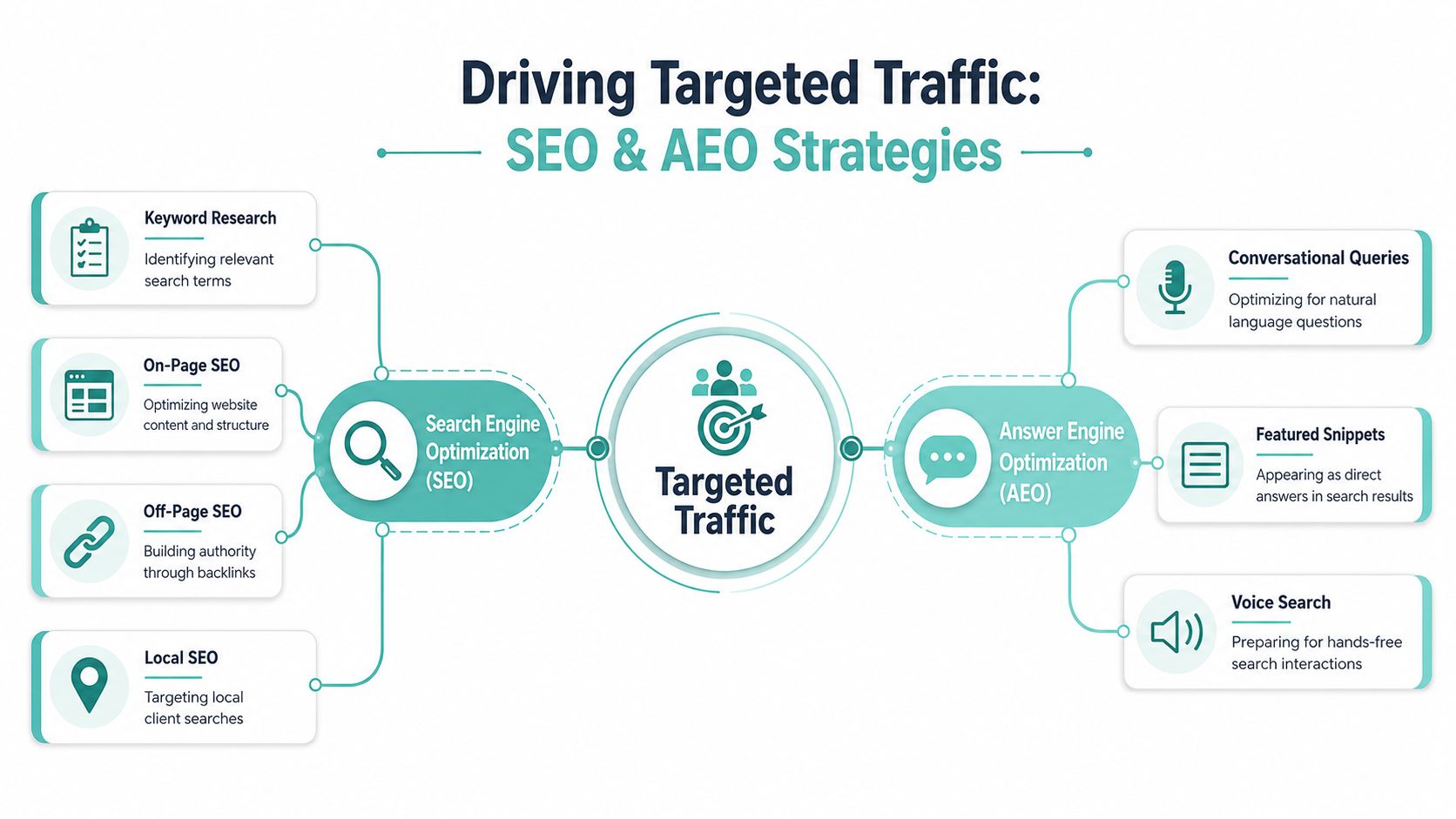
Technical SEO that supports visibility and intake
Technical SEO sets the ceiling and the floor. If Google struggles to crawl the site or visitors hit slow, unstable pages on mobile, rankings and conversions both suffer.
Google's own Core Web Vitals documentation remains the clearest benchmark for law firm sites. The targets are straightforward. Largest Contentful Paint should stay under 2.5 seconds, Interaction to Next Paint under 200 milliseconds, and Cumulative Layout Shift under 0.1. For a personal injury firm, those numbers tie directly to business outcomes. Slow hero images, heavy chat widgets, bloated JavaScript, and weak hosting reduce the odds that a prospect reaches the contact step.
I usually tell firms to make practical fixes before chasing advanced tactics. Compress images into modern formats, defer noncritical scripts, use a CDN, clean up plugin bloat, and test page templates on real mobile devices. A technically clean site gives every practice area page, attorney bio, and location page a fair chance to rank.
Local SEO that connects the website to market demand
Most personal injury firms do not need broad visibility across the country. They need to appear for the right case types in the right cities, suburbs, and counties, then support those rankings with strong local entity signals.
According to Custom Legal's technical SEO guidance for personal injury firms, firms should implement structured data such as LocalBusiness, Attorney, FAQ, and Review, keep NAP information consistent across Google Business Profile and legal directories, and resolve indexing and security issues that weaken trust and discoverability. The same guidance also points to accessibility and schema validation as part of sound technical execution, not optional cleanup.
That means local SEO is not just a citation project. It is an architecture decision. Your city pages, case-type pages, attorney profiles, reviews, FAQs, and Google Business Profile need to reinforce the same geography and services. If they conflict, rankings get diluted. If they align, the website becomes a stronger local authority signal.
For firms that want a more specific playbook, this guide to Google Business Profile SEO for personal injury firms pairs well with a site audit.
AEO and AI-ready content
Many law firm websites lag behind the market. Traditional SEO asks whether a page can rank. AEO asks whether Google, AI Overviews, voice assistants, and answer engines can extract a clear, reliable answer from the page and connect it to a credible legal source.
That changes design decisions early. It affects page templates, heading structure, schema planning, internal linking, and how copy is formatted above the fold.
The strongest PI pages usually include:
- Question-based subheadings: Framed around the way prospects phrase injury and insurance questions
- Direct answers near the top: Brief, plain-language responses before the longer legal explanation
- FAQ sections with schema: Useful for featured answers and machine-readable context
- Entity clarity: Clear references to the firm, attorneys, locations, case types, and service areas
- Depth after the summary: Enough supporting detail to show experience, not just surface relevance
I would not bolt this on after launch. Firms that want durability in search should build pages that work for both rankings and retrieval. If a page only relies on old keyword placement, it is less prepared for AI summaries and zero-click search behavior.
For firms improving legal content quality, this primer on how to learn SEO writing with Humantext.pro is useful because it emphasizes structure, clarity, and search intent rather than filler.
The design takeaway is simple. A future-ready personal injury website should be easy for a person to scan, easy for Google to index, and easy for an answer engine to interpret with confidence. That standard is higher than traditional SEO, and it should shape the site from the first wireframe.
Turning Visitors into Qualified Leads with CRO
Traffic is not the win. Intake is the win. A personal injury site should make it easy for the right prospect to say yes to the first step.
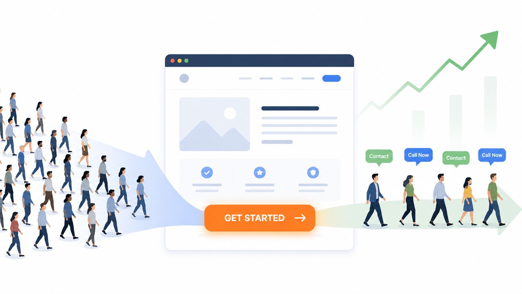
What a visitor needs before taking action
Most injury prospects are evaluating two things at once. First, “Can this firm help me?” Second, “Do I want to deal with these people?”
The page has to answer both.
A high-converting page usually combines emotional reassurance with operational clarity. It acknowledges the problem, explains the case type in plain language, shows evidence of credibility, and presents a next step that feels low friction. “Get a free case review” works better than a vague “Submit” button because it describes the value of acting.
A useful way to evaluate a page is to look for hesitation points:
- Unclear offer: What exactly happens if I call?
- Weak specificity: Do you handle this kind of accident?
- No visible trust: Why should I believe you?
- Too much effort: Why is this form asking for so much?
Reduce friction in the intake path
The fastest way to hurt conversion is to make the first contact feel like paperwork.
Short forms win because they respect the visitor's state of mind. Ask for what intake needs to make contact and qualify the lead. Save the long fact pattern for later, after someone from the firm responds.
This is also where page layout matters. Don't rely on one contact form in the footer. Use multiple paths:
| Contact method | Best use | Design note |
|---|---|---|
| Click-to-call | Urgent, high-intent visitors | Keep it visible in header and on mobile |
| Short form | Visitors who need a lower-pressure step | Limit required fields |
| Live chat | Users with quick questions or hesitation | Keep it available, not intrusive |
| Attorney bio CTA | Referral and trust-driven visitors | Add direct contact options on bio pages |
Some firms also benefit from short explainer videos that clarify the process before intake. If you're considering that format, this AI-powered explainer video guide gives a practical overview of how to create concise educational videos without turning the site into a media project.
Trust signals that help close the gap
Trust signals work best when they reduce doubt at decision moments.
That includes:
- Attorney bios that sound human: Not resume dumps
- Case results with context: Enough detail to signal relevance
- Testimonials placed near CTAs: Not buried on a separate page
- Clear consultation language: Tell visitors what to expect next
The job of CRO on a law firm website isn't to pressure people. It's to remove reasons not to contact you.
Most firms miss this by thinking conversion optimization means louder buttons. It usually means better sequencing. A visitor sees the right message, gets the right proof, and finds the right next step without friction.
For teams that want a deeper process around testing forms, calls to action, and page layouts, conversion rate optimization services can help frame what to measure and refine over time.
Common Website Design Pitfalls That Kill Cases
A car crash victim lands on your site at 9:40 p.m. from a mobile search. They are hurt, frustrated, and trying to decide whether your firm looks competent enough to trust with a serious case. If the page feels generic, hard to scan, or vague about what happens next, they leave and call the next firm.
That is how websites lose cases. Not through one dramatic failure, but through a series of avoidable design and content decisions that create doubt at the exact moment a prospect is ready to act.
Design mistakes that weaken trust
Generic imagery is one of the fastest ways to dilute credibility. If your homepage shows the same staged handshake, courthouse steps, and smiling call center photo used across dozens of firms, the brand signal is weak. Personal injury clients are making a high-stakes judgment in seconds. A site that looks interchangeable gets treated as interchangeable.
Confusing navigation causes a different kind of loss. Practice areas, locations, results, FAQs, attorney profiles, and contact paths all need to be easy to find, especially on mobile. Firms often keep adding menu items instead of deciding what matters most. The result is clutter, hesitation, and more back-button clicks.
Copy causes damage too. Many PI sites still read like bar journal articles or firm brochures. Prospects do not need a lecture on negligence doctrine before they know whether you handle their kind of case, in their area, and what they should do next. Strong legal copy earns trust by being clear, specific, and easy to scan.
Technical and content problems that cost inquiries
A slow site is bad enough. A site that is not structured for answer engines is a bigger long-term risk.
Google still matters, but search behavior is changing. Prospects now ask full questions in search, voice tools, and AI assistants. If your pages are built as wall-of-text marketing pieces instead of clear answer assets, your firm loses visibility in both traditional rankings and AI-generated responses. I see this often on PI sites that look polished but were never planned around question patterns, entity clarity, or page-level topical focus.
Other common problems show up fast in an audit:
- Hidden contact information: Phone numbers or consultation options are hard to find when urgency is high
- Template sameness: Pages look clean but give no clear reason to choose this firm over another local option
- Thin practice area pages: Little detail, weak local relevance, and no useful answers to intake-stage questions
- Accessibility gaps: Low contrast, poor keyboard use, missing alt text, and forms that are harder than they should be to complete
- No answer-ready structure: Long pages bury direct responses instead of surfacing clear questions, short answers, and supporting detail
- Weak AI-readiness signals: Missing schema, vague headings, and inconsistent page structure that make it harder for search engines and AI systems to interpret the firm accurately
There are trade-offs here. Rich visuals can help credibility, but too many effects and scripts slow the site and distract from intake paths. Detailed content can improve relevance, but only if it is organized around the questions injured people ask. Chat tools can increase contact volume, but they can also get in the way if they cover key calls to action on mobile.
A practical review standard is simple. Open each core page and ask: would a serious prospect know, within a few seconds, that you handle this case, in this market, and how to contact you right now? Then ask a second question that firms still miss: could a search engine or AI assistant extract that answer cleanly from the page?
If either answer is no, the site needs work.
The Agency Process From Discovery to Launch
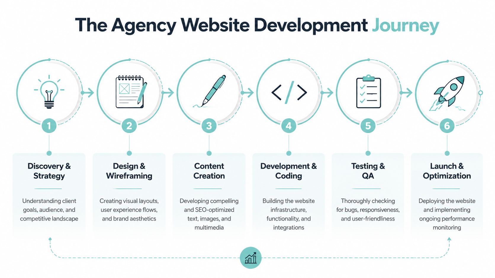
A website project goes wrong when the firm buys mockups before it buys thinking. Good agencies don't start with colors and homepage concepts. They start with fit, goals, intake realities, competitors, and search opportunity.
What should happen before anyone opens Figma or WordPress
The best process starts in discovery. That means understanding:
- Business goals: More calls, better cases, expansion into new markets, reputation improvement
- Audience realities: What prospective clients ask, fear, and need clarified
- Current performance: Existing rankings, traffic, lead quality, and intake bottlenecks
- Competitive position: Which firms dominate local search and how they structure their content
From there, the page hierarchy should get defined before visual design. Personal injury websites usually need a clear relationship between homepage, practice area pages, city pages, attorney bios, FAQs, results, and contact paths. If that architecture is weak, the site may still look expensive while underperforming in search and conversion.
Buy strategy before you buy style. Otherwise you're paying for decoration on top of guesswork.
How build quality separates strong sites from expensive disappointments
Once strategy is set, design and content should move together. Copy shouldn't be an afterthought handed over after layouts are approved. In legal, the messaging determines the layout as much as the layout supports the messaging.
Development is where many redesigns fail. Agencies may promise custom work but rely on heavy themes, excessive plugins, and messy templates that become hard to maintain. The result is a site that launches looking sharp but becomes slow, brittle, and difficult to optimize.
A disciplined build should include:
- Responsive design across devices
- Clean code structure and performance optimization
- Analytics and lead tracking
- Schema and local SEO implementation
- Content formatting for search and AEO
- Accessibility checks and QA before launch
Pricing differences usually come down to scope and rigor. A cheap site often excludes strategy depth, custom content architecture, technical SEO, CRO thinking, and post-launch refinement. A stronger project costs more because more senior work goes into the parts that affect business outcomes.
Launch is the start of the real work
Launch day matters, but it isn't the finish line. It's the point where measurement becomes possible.
After launch, firms should watch which pages attract traffic, where visitors drop off, which forms get completed, which calls to action get ignored, and which practice areas deserve more content support. Search performance and conversion performance need ongoing refinement together.
That's especially true if the site is being built to compete in AI-influenced search. FAQ structures, direct-answer formatting, schema, internal linking, and local relevance all need maintenance as the search environment keeps changing.
Frequently Asked Questions About Law Firm Web Design
How long does a personal injury website redesign usually take
It depends on scope more than visuals. A site with a handful of pages and light content moves much faster than a multi-location PI site with extensive practice area coverage, attorney bios, FAQs, and migration planning. The actual variable is usually decision-making speed and content readiness, not just development.
Should a PI firm choose a template or custom design
Templates can work for very small firms with narrow goals, but they often create sameness. In competitive markets, custom structure usually performs better because it can align brand, search intent, conversion paths, and local content architecture around how the firm wins cases.
What pages matter most
The homepage matters, but it's rarely the whole story. The highest-value pages are usually the homepage, key practice area pages, location pages, attorney bios, FAQ sections, and contact paths. Those pages carry most of the burden for trust, search relevance, and conversion.
How often should a law firm update its website
Continuously, but not randomly. The best updates come from evidence: search data, intake questions, user behavior, and changes in practice focus. Adding useful FAQ content, improving weak pages, tightening calls to action, and refining local relevance usually beats cosmetic refreshes.
Does SEO need to be part of the redesign
Yes. Waiting until after launch to “do SEO later” usually creates rework. Search intent, internal linking, schema, metadata, local signals, and answer-ready formatting should shape the build from the beginning.
What makes a site AI-ready
AI-ready content is structured for extraction and clarity. It uses direct answers, clean headings, FAQ sections, consistent entity signals, and schema that helps machines understand the page. In personal injury lawyer website design, this is becoming part of the core build, not a niche extra.
Who should own the website after launch
The law firm should always own its domain, hosting access, analytics access, CMS access, and core data. Agencies can manage the work, but ownership should stay with the firm. That avoids dependence and makes future transitions far easier.
If your firm is planning a redesign and you want a site built for search visibility, AI readiness, and qualified intake growth, Digital Skyrocket is worth a look. They focus on website design, local SEO, and answer engine optimization for service businesses, and they only take on clients who want the website and SEO strategy to work together.