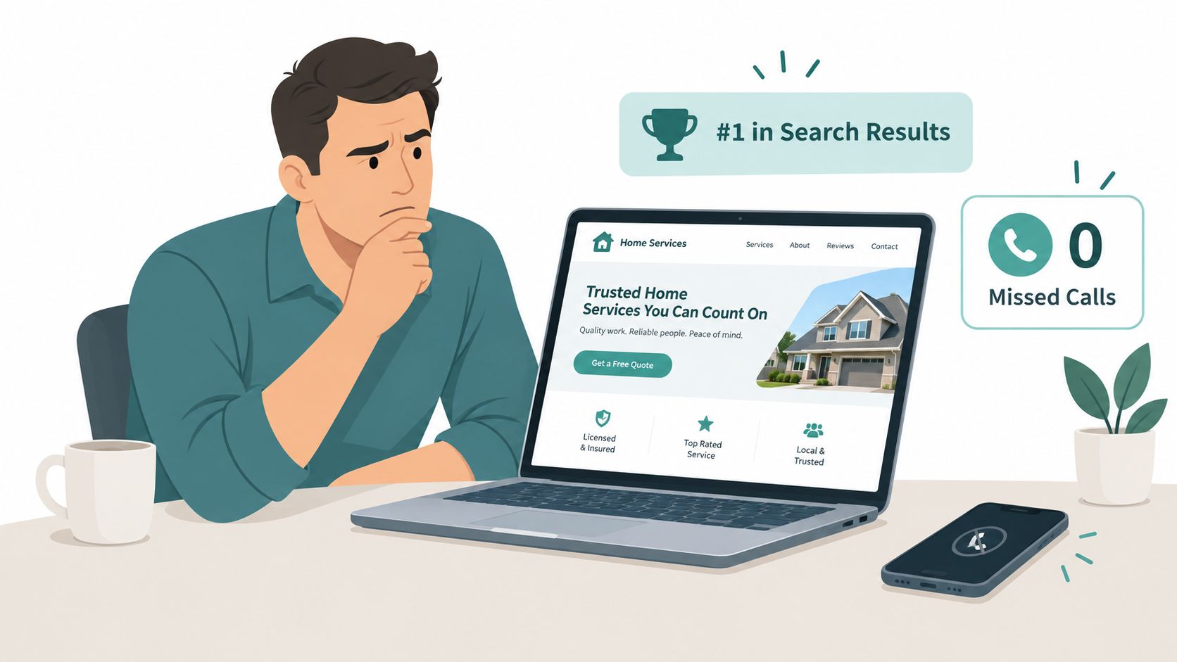
You've invested in local SEO, your rankings look respectable, and the new website photographs well. Yet the phone stays quiet. A homeowner lands on the page, can't quickly confirm that you serve their neighborhood, waits for a hero image to load, and leaves without finding a credible reason to call.
That pattern appears repeatedly across roofing, HVAC, plumbing, electrical, and general contracting websites. Professional appearance earns attention, but accurate information, visible proof, and an obvious next step earn the inquiry. Effective home services website design must help a visitor qualify the business quickly, especially when the search begins with an urgent problem.
Table of Contents
- Why Your Website Gets Clicks But Not Calls
- Understanding the Modern Local Search Journey
- Essential Design Elements That Drive Conversions
- Performance and Accessibility as Conversion Constraints
- Building Trust Through Proof and Reputation Management
- Comparing Brochure Sites With Conversion-Focused Designs
- Measuring Design Performance and Iterating
- Moving From Design to Ongoing Lead Generation
Why Your Website Gets Clicks But Not Calls
A roofing contractor once showed us a website with polished branding, attractive project photography, and strong organic visibility. The homepage still failed at the moment that mattered. The phone number sat in the footer, the service area appeared only on a generic contact page, and the first screen said little about emergency availability or credentials.
The site attracted visitors, but it made them work to answer basic questions:
- Can this company handle my specific problem?
- Does it serve my address?
- Is someone available now?
- What happens after I call or submit a form?
- Why should I trust this contractor over the next result?
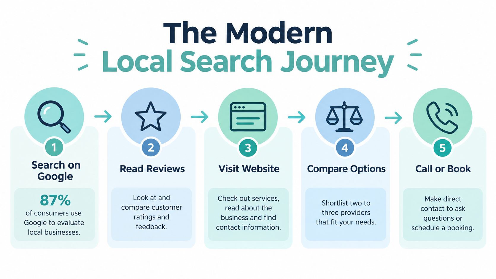
Those questions begin before the first click. BrightLocal reported that 87% of consumers used Google to evaluate local businesses in 2022, up from 81% in 2021, while 76% regularly read online reviews during local-business research (BrightLocal's 2023 local consumer review survey). A website is no longer merely an online business card. It's the place where searchers verify the information they saw in Google, Maps, and review platforms.
Design for qualification, not browsing
A visitor searching for roof repair, AC replacement, or an emergency plumber isn't browsing casually. They're assembling evidence about credibility, availability, geographic fit, and risk. A generic service page that says “quality solutions for your home” gives them almost nothing to evaluate.
A focused page leads with the service, location, urgency, proof, and next action. For example, someone comparing options can examine a useful resource such as how to find a licensed San Antonio plumber while checking whether a contractor explains qualifications and emergency coverage clearly.
The practical objective is simple: reduce uncertainty at every major decision point. For a deeper look at the mechanics behind this work, review how to increase conversion rate on a website, then audit whether your own pages make calling or booking easier than leaving.
Understanding the Modern Local Search Journey
A homeowner may find a contractor in Google, check the map listing, read reviews, open a service page, compare availability, and ask an AI assistant for another opinion. A polished website can still lose the lead if its service area, hours, contact details, or claims conflict with those other sources. The winning design supports the full journey with accurate, easy-to-check information.
More recent findings show that 74% of consumers checked two or more review platforms before making a decision (BrightLocal's 2025 consumer research). Every listing, review profile, and website page contributes to the customer's evidence. A mismatch, such as different phone numbers or unclear service coverage, creates doubt at the point when a visitor is deciding whether to call.
Three discovery paths, one conversion system
Traditional search still drives most local discovery. A 2025 U.S. consumer study found that 78.7% of respondents primarily used traditional search engines, while 2.0% primarily preferred AI assistants. The same study reported that 27.3% had used an AI assistant to find a local business during the preceding week (the 2025 local-search survey summary).
A separate four-country survey found that 68% of consumers had used ChatGPT to research local products or services, yet only 19% trusted AI search tools for local search, compared with 45% for traditional search. Those results do not justify replacing Google-focused content with generic “AI-optimized” copy. They point to a broader requirement: make the business clear and trustworthy wherever customers research it.
Build an evidence hierarchy
Start with crawlable service and location pages that state what the company does and where it operates. Then answer practical questions in plain language:
- Eligibility: Which systems, roof types, equipment, or property conditions does the company handle?
- Availability: Does it offer emergency service, same-day appointments, or scheduled estimates?
- Pricing: What affects the estimate, and are financing options available?
- Qualifications: Which licenses, certifications, warranties, or manufacturer relationships apply?
- Next step: Should the customer call, request an estimate, or schedule an appointment?
Structured content can help search systems extract answers, but keyword repetition should never replace useful context. Keep business details accurate across profiles and pages, then measure organic visibility, branded demand, identifiable AI-referred visits, calls, forms, and booked jobs separately. An appearance in an answer engine matters only when it contributes to a qualified enquiry.
Essential Design Elements That Drive Conversions
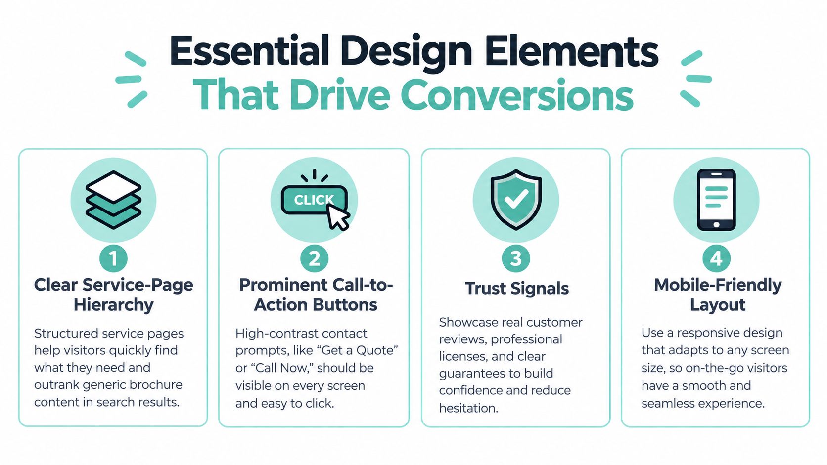
A polished contractor website can still lose qualified leads if visitors cannot confirm the service, trust the claims, or find the next step. Conversion-focused design makes those decisions clear through page structure, accurate business information, proof, and contact options.
Give every service a clear route
A roofing company should not send visitors from a vague “solutions” menu to a generic contact form. Build focused pages for roof repair, roof replacement, storm damage, and inspections, then connect each page to locations the company serves.
Use a consistent question sequence on every service page:
- What service is available?
- What problem does it solve?
- Which properties or systems qualify?
- Where is the service offered?
- What evidence supports the claim?
- What should the visitor do next?
Location pages require the same accuracy. Match the actual service area, business profile, phone number, hours, and availability. A city page may attract impressions when the company does not work there, but the resulting rejected appointment damages trust and sends the customer to a competitor.
Put contact options where decisions happen
Place a click-to-call button in the mobile header and near the primary call to action on desktop. Add short estimate forms, appointment choices, or persistent contact controls after the introduction, beside proof, and near the end of the page.
Ask only for information that helps route the enquiry, such as name, preferred contact method, service type, ZIP code, and a concise description of the problem. Persistent labels, keyboard access, clear instructions, and specific error messages make forms easier to complete and support guidance from the U.S. Department of Justice.
A commercial electrical customer may compare your form with a request a free electrical quote. If your form demands detailed project information before anyone has assessed the work, shorten it. The intake team can collect technical details later.
Show proof that answers objections
Replace broad claims with evidence visitors can evaluate:
- Project evidence: Show recent project types and caption the work completed.
- Professional evidence: Display relevant technician credentials and licensing information.
- Risk reduction: Explain warranties, guarantees, and the process for resolving returned problems.
- Financial clarity: State financing qualifications and estimate conditions accurately.
- Local relevance: Name actual neighborhoods, towns, or service boundaries.
Responsive layouts must preserve this hierarchy on mobile, tablet, and desktop. A visually impressive desktop page fails when it hides the phone number or places proof several screens below the introduction. Review web design best practices when refining layout decisions, then test each page from the customer's perspective. Every screen should help the visitor decide and act.
Performance and Accessibility as Conversion Constraints
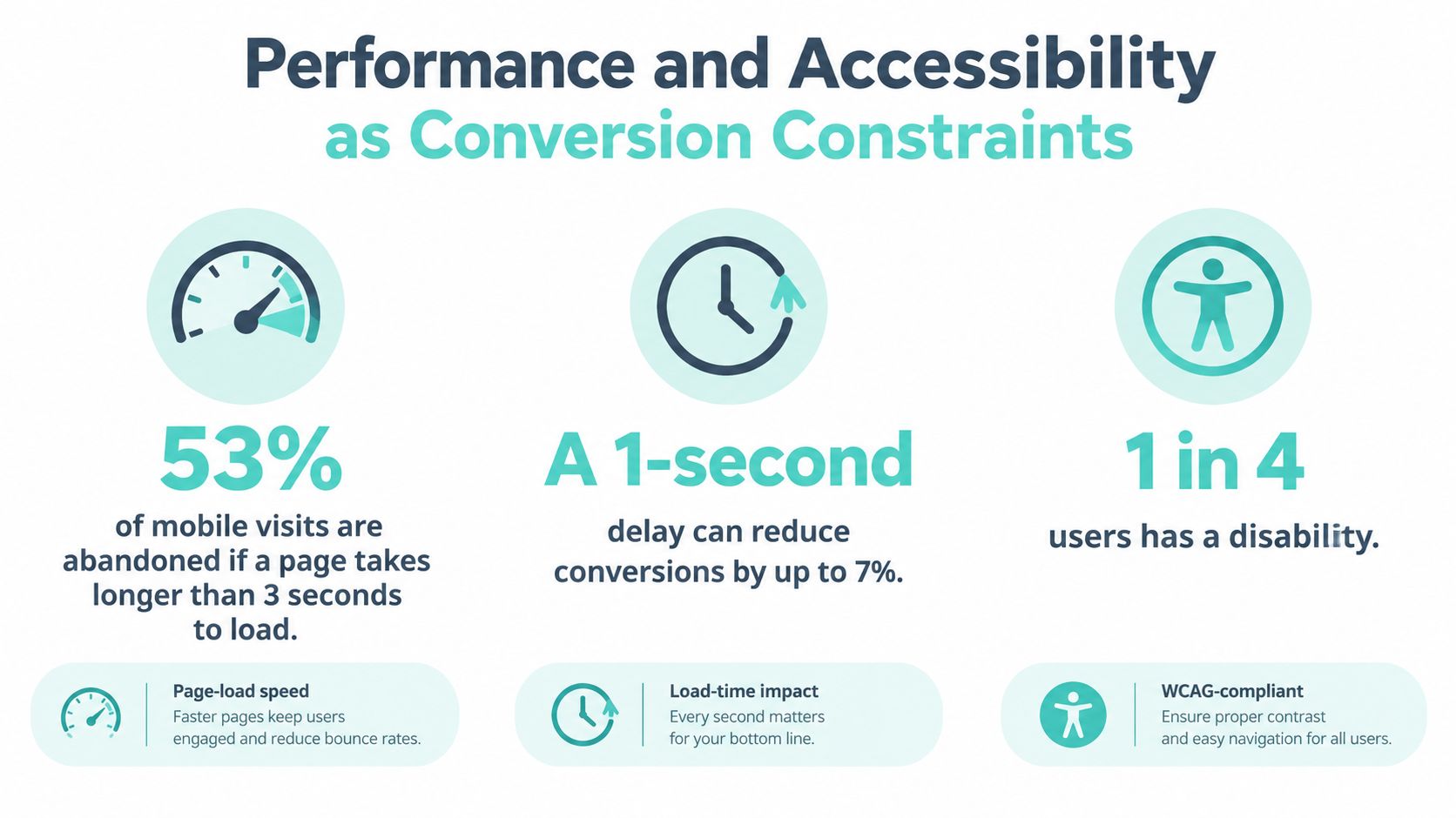
A slow page can block a lead before the visitor sees the phone number. Google reports that 53% of mobile visits are abandoned when a page takes longer than three seconds to load. Its analysis also found that raising load time from one to three seconds increases the probability of bounce by 32%, while increasing it from one to five seconds raises that probability by 90% (Google's speed research).
Remove delay before the first decision
For a homeowner with a failed AC system or an active plumbing leak, the page must reveal the service and contact route quickly. Google's stated practical benchmarks are usability within three seconds on 4G and within five seconds on mid-range devices over 3G (Google's speed scorecard guidance).
Prioritize the pages that receive local organic traffic, especially location pages, emergency-service pages, and quote-request landing pages. Compress and properly size hero images, use modern image formats, eliminate render-blocking scripts, reduce third-party tags, cache static assets, and reserve image space to prevent layout shifts. A website speed optimization service should validate improvements with real-user data, not only a fast desktop laboratory score.
Treat accessibility as implementation work
A 2025 WebAIM evaluation of the home pages of the top 1,000,000 websites detected 50,960,288 distinct accessibility errors, averaging 51 errors per page. Common issues included low-contrast text, missing alternative text, and missing form labels (WebAIM's 2025 Million report).
That sample covers home pages across the web, so it doesn't establish a contractor-specific conversion loss. It does show how widespread preventable defects remain. Use sufficient contrast, meaningful alternative text, programmatic labels, visible keyboard focus, logical tab order, large touch targets, and layouts that remain usable at browser zoom.
Test a quote form with keyboard-only navigation, screen readers, mobile browsers, and invalid input. If a customer can't identify the service, understand the instructions, or correct an error without losing entered information, the interface is costing you opportunities.
Building Trust Through Proof and Reputation Management
A polished site can't compensate for conflicting business information. Customers notice when the phone number differs between the website and Google profile, when a service-area page promises coverage the dispatcher doesn't provide, or when recent complaints sit unanswered.
Recent U.S. research found that 75% of consumers read at least four reviews before deciding, 53% are unlikely to visit a business with incorrect listings, and 59% expect a response within 24 hours when they contact a business (the 2025 local-search reputation findings). Those figures connect reputation management directly to interface design and operations.
Turn reputation into page content
Don't place a five-star badge beside a generic testimonial and call it proof. Show specific, verifiable evidence that helps a homeowner choose:
- Recent project categories, not only posed team photographs
- Review themes tied to punctuality, workmanship, cleanup, and communication
- Technician credentials and relevant licenses
- Warranty terms written in understandable language
- Financing qualifications and estimate expectations
- Accurate coverage for each location page
A roofing page can summarize recurring customer feedback about storm inspections or cleanup. An HVAC page can explain how the company handles diagnostic visits, replacement estimates, and follow-up. Specificity makes the evidence useful.
Connect proof to response
The contact path must match urgency. Emergency visitors need an immediate click-to-call option, while nonurgent customers may prefer a short estimate form or appointment request. The form confirmation should explain what happens next and set a realistic response expectation.
Reporting should connect the customer experience rather than isolate marketing metrics. Track listing accuracy, review response time, form completion, call quality, and booked-job rates together. A website that generates many low-quality inquiries isn't necessarily succeeding, and a strong review profile can't rescue an intake process that leaves qualified callers waiting.
Comparing Brochure Sites With Conversion-Focused Designs
The difference between a brochure site and a lead-generation site becomes obvious when you compare what each one asks a visitor to believe.
| Design Element | Brochure Site Approach | Conversion-Focused Approach |
|---|---|---|
| Service presentation | Lists broad categories such as “home solutions” | Creates focused pages for roof repair, AC replacement, emergency plumbing, or other high-intent needs |
| Service areas | Mentions a region in the footer | Shows actual cities, neighborhoods, ZIP codes, and availability on relevant pages |
| Project proof | Uses stock photography or undifferentiated galleries | Shows recent project types with captions, credentials, warranties, and relevant outcomes |
| Phone access | Hides the number in the footer or behind a form | Provides click-to-call access wherever a visitor is ready to act |
| Testimonials | Displays vague praise without context | Groups review themes around communication, response, workmanship, and job type |
| Lead form | Requests every possible detail at the first interaction | Collects only information needed to route and qualify the inquiry |
| Pricing information | Avoids all discussion of estimate conditions or financing | Explains what affects price and states available financing qualifications accurately |
| Follow-up | Confirms submission without setting expectations | Explains the next step and provides an appropriate alternative contact path |
A roofing page that only lists “repairs, replacements, and inspections” leaves the customer to guess whether the company has handled their roof type or storm problem. A stronger page displays relevant project evidence, technician qualifications, warranty terms, financing information, and geographic coverage in the same decision path.
Form length deserves similar scrutiny. Baymard found that 17% of online shoppers had recently abandoned an order solely because checkout was too long or complicated. Its ecommerce research found that an ideal checkout can be as short as 12 to 14 total form elements, while the average U.S. ecommerce checkout displayed 23.48 elements by default (Baymard's form usability statistics). Contractor forms aren't ecommerce checkouts, so these figures aren't a guaranteed forecast for lead conversion. They do reinforce a sound design principle: every required field creates friction, and unnecessary questions should wait until they're operationally needed.
Measuring Design Performance and Iterating
A redesign should produce evidence, not just approval in a conference room. Start with field data because a desktop laboratory test can't represent the devices, networks, browsers, and landing pages your customers use.
Track experience by page and device
Measure real-user Largest Contentful Paint, Interaction to Next Paint, and Cumulative Layout Shift by device and landing page. Prioritize pages receiving local organic traffic, including location pages, emergency-service pages, and quote-request pages. These pages often provide the first conversion opportunity, so a problem there deserves attention before a low-traffic blog template.
Review the data alongside practical behavior:
- Call activity: Separate calls by landing page and distinguish answered conversations from missed calls.
- Form behavior: Monitor completion, field-level abandonment, validation errors, and successful CRM handoff.
- Lead quality: Compare service type, location, urgency, and booked-job status.
- Page clarity: Check whether visitors reach service, proof, and contact elements before leaving.
Test the intake experience before launch
Run keyboard-only navigation, screen-reader checks, mobile-browser tests, and invalid-input scenarios before publication. Confirm that error messages sit beside the failed field, entered data remains intact, and focus moves to the next useful action.
After launch, look for patterns rather than reacting to one unusual day. If visitors repeatedly abandon the ZIP code field, clarify its purpose or change the input behavior. If emergency visitors view the page but rarely call, examine phone prominence, availability language, and response expectations before rewriting the entire page.
The WebAIM evaluation cited earlier found 50,960,288 accessibility errors across the home pages of the top 1,000,000 websites, averaging 51 errors per page (WebAIM's 2025 evaluation). Use that benchmark as a reminder to test concrete interface conditions, not as proof of a contractor-specific loss.
A useful reporting view brings rankings, organic traffic, form activity, call quality, reviews, and booked jobs into one place. Design iteration becomes rational when the team can see which changes improve qualified inquiries rather than merely increasing visits.
Moving From Design to Ongoing Lead Generation
A contractor website can look polished and still send qualified prospects to a competitor. The difference is an operating system that keeps search intent, service accuracy, proof, and intake aligned. Local SEO needs a relevant destination, answer engines need reliable information, and visitors need a clear path to a useful conversation.
BrightLocal's consumer search behavior research confirms that Google remains a default entry point for local searches, while local-business discovery represents a meaningful share of consumer search activity. The practical response is to build around real service-and-location demand. Create pages that match what customers need, show where the company works, and make the next action obvious.
Use a two-stage improvement process
Start with discovery. Review rankings, landing pages, call paths, listing accuracy, service boundaries, form behavior, and booked-job data. Use those findings to create a page hierarchy that connects high-intent searches with specific services, locations, evidence, and contact options.
Then implement the system across responsive WordPress development, technical performance, analytics instrumentation, form tracking, local SEO, answer engine foundations, and conversion refinement. Ongoing work should use behavior and lead quality to adjust layouts, calls to action, content, and intake fields. Someone researching planning exterior upgrades in central Ohio still needs clear service relevance, trustworthy proof, accurate coverage, and a sensible next step.
Digital Skyrocket is one example of an agency combining custom WordPress development, service-focused content strategy, technical SEO, answer engine optimization, analytics instrumentation, and conversion refinement for service businesses. The meaningful choice is whether the team can connect visibility with calls, forms, qualified inquiries, and booked work.
Audit the first screen, service-area accuracy, proof, phone access, form friction, and real-user performance. If the site looks credible but leaves visitors uncertain, fix the points that delay contact before changing its visual style. Then contact Digital Skyrocket to discuss a website and ongoing SEO program built around qualified leads, measurable intake, and continuous improvement.