You paid for a website. You invested in SEO. You might even be getting solid traffic from Google for your city and service terms. But the leads feel random, the contact form stays quiet, and the calls you do get aren't the kind of inquiries you want.
That usually means the site isn't failing at visibility. It's failing at conversion.
For service businesses, that gap is expensive. A visitor lands on your homepage or service page, scans for a few seconds, and makes a fast judgment. Can I trust this company? Do they handle my exact problem? Is there an easy next step? If the page doesn't answer those questions immediately, the visitor leaves and calls someone else.
Most conversion advice online was written for e-commerce stores. Service websites work differently. You're not trying to get someone to add a product to cart. You're asking them to start a real conversation about a legal case, a roofing issue, a broken AC unit, or a major home project. That takes trust, clarity, and less friction than most sites deliver.
Table of Contents
- From Traffic to Leads Why Your Website Is a Leaky Bucket
- Establish Your Conversion Baseline
- Build Immediate Trust and Persuasion On-Page
- Optimize Your Contact Forms and Inquiry Funnels
- Capture Technical Wins for Higher Conversions
- Adopt a Practical A/B Testing Framework
- Prioritize Changes and Measure Lead Outcomes
From Traffic to Leads Why Your Website Is a Leaky Bucket
You pay for SEO, Google Ads, or Local Service Ads. People land on the site. Then the phone stays quiet, quote requests stay flat, and the team starts asking for more traffic.
For service businesses, that is usually the wrong diagnosis.
The core problem is often the gap between interest and inquiry. A visitor arrives with a real need, scans the page for proof that you are credible, responsive, and safe to contact, then leaves because that confidence never forms. E-commerce sites can recover some hesitation with discounts, cart emails, and lower-stakes purchases. Service businesses do not get that luxury. A law firm, contractor, med spa, or HVAC company is asking for a higher-trust action on the first visit.
That is why conversion rate optimization matters here. It is not about squeezing more clicks out of the same design. It is about removing the points where a good prospect loses confidence, gets distracted, or decides to keep looking.
Even small gains matter because more of your existing traffic turns into leads. You do not need a third-party study to prove the math. If the same traffic produces more qualified inquiries, revenue potential goes up without increasing ad spend. The catch is that service sites rarely lose leads because of one dramatic mistake. They lose them through a series of trust and friction problems that feel minor on their own but add up fast.
I see the same pattern in audits:
- First-screen copy explains the service, but not why this company is the safe choice
- Calls to action exist, but they compete with clutter or appear too late
- Trust signals are weak, generic, or missing at the moment doubt shows up
- Contact paths feel like work, especially on mobile
- Tracking is incomplete, so the team cannot see where inquiries drop off without a proper Google Analytics 4 setup
The details change by industry, but the buying behavior is consistent. A legal prospect wants signs of competence and discretion before submitting a case review. A homeowner with no AC wants fast proof that you serve their area and can respond quickly. A commercial roofing buyer wants evidence that your company is established, insured, and experienced with projects that carry real risk.
Service CRO starts there. Before a visitor fills out a form, they need enough confidence to believe contacting you will lead to a useful conversation, not wasted time.
A lot of advice on how to increase conversion rate on website performance focuses on button colors, headline formulas, or generic best practices pulled from online stores. Those tactics have their place, but they miss the bigger issue for service companies. The primary win usually comes from building trust faster, reducing hesitation, and making the next step feel straightforward for someone making a high-stakes decision.
Establish Your Conversion Baseline
A service business can lose leads for months while the owner keeps changing headlines, swapping photos, and adding new calls to action. The phone still feels quiet. The form still underperforms. No one can say whether the problem is weak traffic, low trust, a broken form, or a page that gets attention but never creates contact intent.
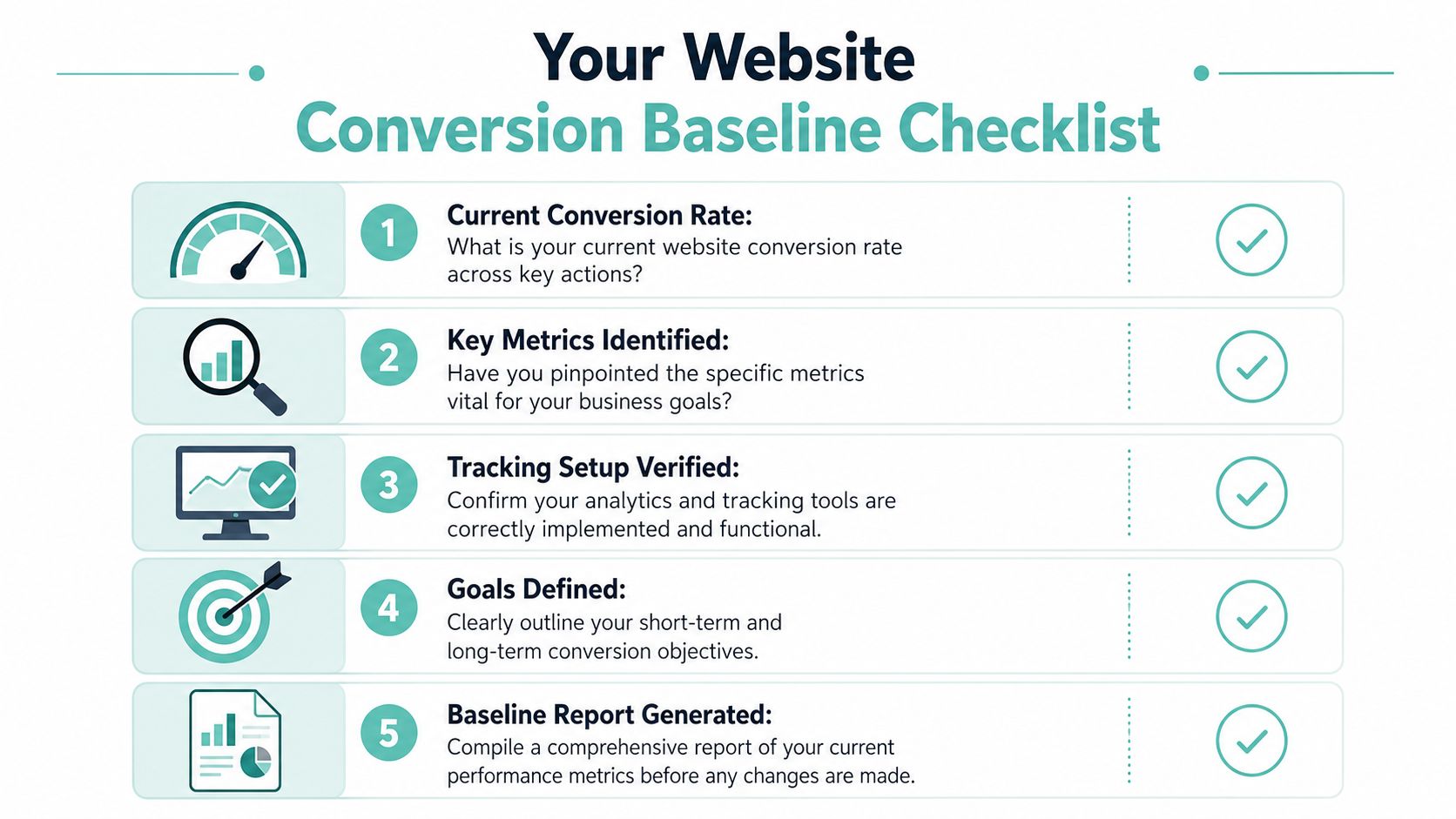
Start with a baseline. That means documenting how the site performs today before changing copy, layout, or offers. The wider conversion research library at ConversionXL describes CRO as a process built on research, hypothesis, prioritization, testing, and learning. For service businesses, that process only works if you first define what a real lead action looks like and where prospects abandon the path.
Track the actions that matter
Too many service companies measure one thing: completed forms. That misses a large share of buying intent, especially on mobile and especially for high-stakes services where prospects want a quick human answer before committing.
Use a short conversion list tied to actual inquiry behavior:
- Primary form submissions: Estimate requests, consultation forms, inspections, case reviews.
- Phone click events: A strong signal on mobile service and location pages.
- Email clicks: Useful for commercial buyers and longer sales cycles.
- Scheduling clicks: Important if you send visitors into a booking tool.
- Thank-you page views: Helpful as a second check that submissions completed.
If tracking is incomplete, fix that first. A clean Google Analytics 4 setup gives you event tracking, conversion definitions, and page-level paths you can trust.
I also recommend separating soft conversions from hard conversions. A visit to a contact page is interest. A submitted form, booked appointment, or phone click is lead intent. Mixing those together makes weak pages look healthier than they are.
Segment the baseline before you diagnose anything
Averages hide the underlying problem.
Homepage traffic behaves differently from local service-page traffic. Branded visitors usually convert differently from first-time Google search visitors. Mobile users often show stronger urgency but less patience, which matters a lot for plumbers, HVAC companies, attorneys, clinics, and other service businesses where the inquiry carries risk or time pressure.
At minimum, break performance out by:
- Page type: Homepage, service pages, location pages, contact page
- Device: Mobile and desktop
- Traffic source: Organic search, paid traffic, branded traffic, referral
- Lead action: Form, phone click, scheduling click, email click
This is also where content strategy starts to matter. If educational pages bring in early-stage visitors, they may support lead generation without converting on the first session. A stronger content marketing strategy for lead generation can help you judge those pages by assisted value instead of direct form fills alone.
Look at behavior, not just reports
Analytics shows where the drop happens. Behavior tools help explain why.
Heatmaps, scroll maps, and session recordings are useful on pages that carry real buying intent:
| Page type | What to check | Common issue |
|---|---|---|
| Service page | Scroll depth and CTA clicks | Visitors read but never reach the next step |
| Contact page | Form interactions and exits | Fields create friction or error handling is unclear |
| Homepage | First-screen engagement | Visitors keep searching for proof before taking action |
| Location page | Phone taps and bounce behavior | The page ranks for local intent but does not produce contact |
Look for repeated patterns, not isolated sessions. If multiple users pause near pricing language, tap logos that are not clickable, abandon a form at the same field, or keep returning to the same proof element, you have a real diagnosis point.
For service businesses, this matters more than it does on many e-commerce sites. The blocker is often hesitation, not product comparison. People are trying to answer a harder question: "Can I trust this company enough to start a conversation?"
A useful first baseline is simple. Record top landing pages, conversion actions, conversion rate by segment, and the biggest drop-off points. That gives you enough clarity to fix what is suppressing leads instead of making cosmetic updates that do not change inquiry volume.
Build Immediate Trust and Persuasion On-Page
A homeowner lands on your site after finding a leak, a legal issue, or a contractor problem. They are not browsing for inspiration. They are trying to answer one question fast: should I trust this company enough to reach out?
That is the conversion hurdle on service websites. E-commerce visitors can compare products, prices, and checkout terms. Service buyers are judging risk. They want signs that you are legitimate, experienced, responsive, and used to handling this exact kind of job.
That is why a polished design alone rarely fixes lead volume. If the first screen looks nice but leaves basic credibility questions unanswered, people keep scanning, hesitate, or leave.
Trust has to show up before the sales copy
The hero section on a service page has a job to do. It needs to confirm fit and reduce anxiety within a few seconds.
In practice, the best first screens usually cover four points:
- What you do: Name the service in plain language.
- Who you do it for: Show the area, property type, case type, or customer type.
- Why you are credible: Reviews, certifications, licenses, associations, years in business, or recognizable client logos.
- What happens next: A clear next step such as request an estimate, book a consultation, or call now.
This matters more in high-stakes categories. A criminal defense firm, mold remediation company, med spa, or commercial roofer is not selling a low-risk purchase. They are asking a stranger to start a serious conversation. That requires proof early, not halfway down the page.
If you review session recordings and heatmaps, you can often spot where trust breaks down. Visitors hover over badges, hunt for reviews, scroll up and down looking for an address or phone number, or stall near vague claims. This breakdown of actionable insights for customer journeys is useful if you want a sharper review process for those on-page hesitation points.
What strong service pages do differently
High-converting service pages usually feel specific and grounded. They do not sound like brand workshops. They sound like a competent business that knows the job and knows the local buyer.
A few patterns show up again and again:
- Specific headline: "Emergency AC Repair in Tyler" gives visitors immediate confirmation. "Comfort you can trust" does not.
- Proof near the top: Review ratings, licensing details, association memberships, insurer approvals, or media mentions belong high on the page.
- Concrete supporting copy: Explain response time, service area, process, specialization, or the types of problems you handle.
- CTA tied to intent: "Request a Roof Inspection" or "Book a Case Review" sets clearer expectations than "Submit."
I also look closely at the kind of proof being used. Generic testimonials are better than none, but they are rarely enough for a cautious buyer. Stronger proof includes specifics. Did the team respond quickly? Solve a difficult problem? Communicate clearly? Finish on time? Keep the cost in line with the estimate?
Case examples work well here, especially for services with a longer sales cycle. A short proof block on the page often does more for inquiry rate than a separate testimonials page nobody visits. If your broader lead strategy depends on turning expertise into trust, this guide on content marketing for leads fits well with that approach.
Visitors convert when the page lowers perceived risk and makes the next step feel safe.
Treat your hero section like the front desk of the business. It should greet, reassure, and direct. On service websites, that usually moves more leads than another design refresh.
Optimize Your Contact Forms and Inquiry Funnels
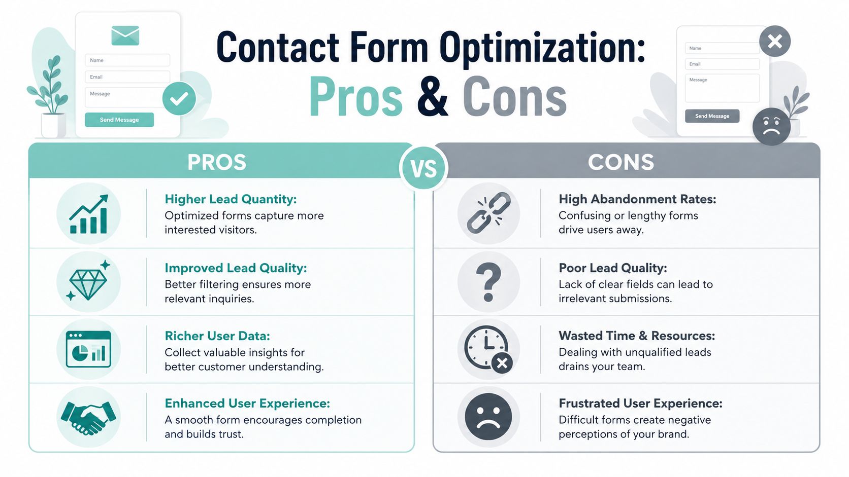
A service prospect finally decides to reach out. They click "Request a Quote," hit a long form, get asked for six pieces of information your team does not need yet, and leave. That drop-off is common on service sites because the inquiry step often feels like paperwork instead of the start of help.
On a service website, the form has one job. Get the conversation started without adding friction or doubt.
What to remove from your forms
The right form length depends on lead value, sales cycle, and how much qualification your team can handle. A criminal defense firm may need a little more context than a plumbing company. But many service businesses ask for details they only use after the first call.
I usually review every field with one question: does the team need this before making contact, or would it just be nice to know?
Cut the fields that create drag:
- Curiosity fields: Budget, timeline, company size, or referral source often belong in follow-up, not first contact.
- Duplicate asks: If you're requesting a phone number, you may not need a separate "preferred contact method" field on the same form.
- Internal categories: Visitors should not have to sort themselves into your internal service labels to submit an inquiry.
- Large open text requirements: "Tell us everything" lowers completion rate. A short prompt gets more starts and more submissions.
For higher-stakes services, there is a trade-off. Less friction usually gets more inquiries. More qualification can improve lead quality. The fix is not always a shorter one-page form. Often it is a better sequence.
A two-step intake can work well when the first step is easy. Ask for the basics first. Then gather case details, property details, or project scope after the visitor has already committed to continuing.
How to make the final step feel easy
Field count matters, but wording carries a lot of the conversion load at this point. Service buyers are not ordering a product. They are deciding whether to trust a business with a problem that may be expensive, urgent, or sensitive.
Small copy changes reduce hesitation:
| Weak choice | Better choice | Why it helps |
|---|---|---|
| Submit | Request My Estimate | Sets a clear expectation |
| Message | Briefly describe the issue | Helps the visitor answer faster |
| Error | Please enter a valid phone number | Shows how to fix the problem |
| Contact Us | Talk to a technician | Feels specific and human |
The text around the form should answer the questions people think to themselves. How soon will someone reply? Will this start a sales chase? Is my information private? A single line under the button can do real work here: "We reply within one business hour" or "Your information stays private."
This matters even more for high-trust service categories. A personal injury prospect, divorce client, or homeowner dealing with an insurance claim is not looking for a clever form. They want a clear next step that feels safe. That is why focused intake pages usually outperform generic contact pages in serious service categories. This breakdown of lead generation for law firms shows how tighter intake paths help qualified inquiries move forward.
Keep the funnel consistent after the click, too. If the CTA promises a "Free Case Review," the form headline, supporting copy, and thank-you page should continue that same promise. Any mismatch creates doubt right when the visitor is deciding whether to finish.
Good inquiry funnels feel light, specific, and reassuring. That is what gets more service leads across the line.
Capture Technical Wins for Higher Conversions
A homeowner taps your ad from their phone because the AC stopped working. The page stalls, the headline jumps as images load, and the call button sits under a sticky banner. They do not study your credentials. They hit back and call the next company.
That is how technical issues hurt service businesses. They do not just lower engagement metrics. They weaken trust at the exact moment a high-intent visitor is deciding whether you feel credible enough to contact.
Speed affects trust before copy does
On a service site, speed shapes the first impression. A slow page suggests slow follow-up, dated systems, or a company that does not pay attention to details. For a restaurant, that may be annoying. For a law firm, medical practice, roofer, or home services company, it can cost the inquiry.
Google explains in its Core Web Vitals documentation that loading stability, responsiveness, and visual movement all affect page experience. That matters in CRO because service buyers are often making higher-stakes decisions than an e-commerce shopper adding a low-cost item to cart.
The fixes that produce the fastest gains are rarely glamorous:
- Compress large images: Team photos, location shots, and hero banners are common slowdowns.
- Remove scripts that do not support lead generation: Extra trackers, chat widgets, sliders, and animation libraries often add weight without improving inquiry volume.
- Cut heavy page features: Background videos and rotating banners usually create more drag than persuasion.
- Use lighter templates on core landing pages: The pages meant to generate calls and form fills should be the fastest pages on the site.
I usually tell clients to judge every technical element with one question: does it help a serious prospect contact you faster? If not, it is a candidate for removal.
Mobile friction is where many leads disappear
Service traffic is often mobile and urgent. People are comparing providers in a parking lot, between meetings, or while dealing with a problem at home. They are not patient.
A few common issues show up again and again:
- Buttons and phone links are hard to tap: If a visitor has to zoom in, the page is already working against you.
- Important content loads too low: Reviews, certifications, service area details, and contact actions need to appear early.
- Sticky bars block the screen: A mobile CTA should help the visitor act, not hide the page.
- Layouts break the reading path: Long stacks of badges, galleries, and accordions can bury the one action that matters.
Site structure plays into this too. Pages tend to get bloated when there is no clear hierarchy for service lines, locations, and conversion paths. A clean sample sitemap for website planning helps prevent that sprawl before it turns into slower pages and muddled journeys.
Technical cleanup should follow lead value
Not every page deserves the same effort. Start with pages tied to revenue. Service pages, location pages, and top landing pages should get attention before lower-intent blog content or gallery pages.
This is the trade-off. Owners often want rich pages with videos, animations, and every proof point above the fold. In practice, the better converting version is usually simpler, faster, and easier to scan. The goal is not to win a design award. The goal is to get the call, form submission, or booked consultation from a visitor who already has a problem to solve.
Technical cleanup supports that outcome directly.
Adopt a Practical A/B Testing Framework
A service business does not need an aggressive testing program. It needs a controlled way to answer a simple question: which page change gets more qualified inquiries from people who are already close to contacting you?
That matters because service-site conversion problems usually come from trust gaps, unclear next steps, or friction around the inquiry action. The best tests focus on those points first. If you want more ideas on how to turn website visitors into customers, start with the pages where buyers are deciding whether your company feels credible enough to contact.
A practical framework is straightforward: measure current performance, identify the drop-off, write a clear hypothesis, run one controlled test, then keep or discard the change based on lead impact. I use that sequence because it keeps teams from skipping straight to random edits. It also forces a business to define what success means before the test starts.
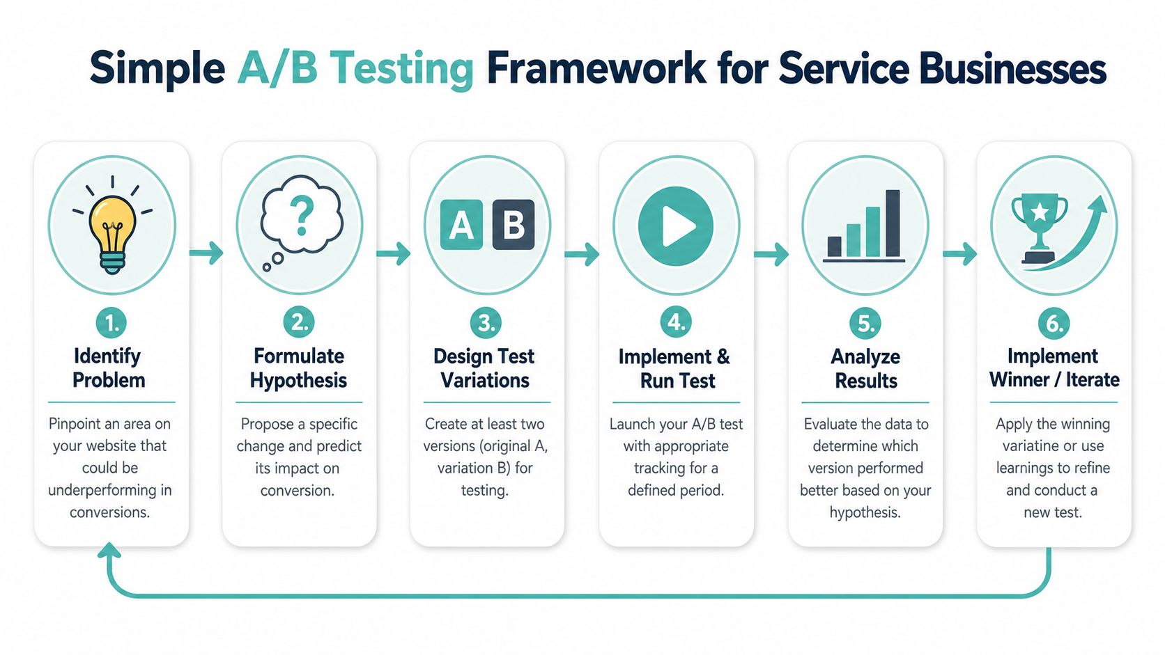
One real test to run first
Start with a page that already gets relevant traffic and has one clear conversion action. For many service businesses, that is a core service page or location page where visitors are reading but not taking the next step.
A useful first hypothesis looks like this:
If we change the CTA from "Learn More" to "Get a Free Estimate," more visitors will click because the action is specific and better matches high-intent service buyers.
That works because it includes the full logic of the test:
- The problem: CTA clicks are low.
- The change: Rewrite the button text.
- The reason: Clearer language should reduce hesitation.
Keep the rest of the page stable. If you change the headline, button copy, hero image, and testimonial placement at the same time, you lose the ability to tell which change helped.
For service sites, strong early test candidates usually include:
| Element | Why it's worth testing |
|---|---|
| Hero headline | It affects clarity and first-impression credibility |
| Primary CTA text | It sets the expectation for what happens after the click |
| Trust block placement | It can reduce doubt before the visitor reaches the form |
| Form heading | It changes how easy or demanding the inquiry feels |
What makes test results useful
Poor testing usually comes from impatience. A business owner sees three extra form fills after a quick edit and assumes the page is fixed. On low-volume service pages, that is rarely enough evidence to make a confident call.
Use a tighter standard:
- Set the baseline first: Record current conversion rate, lead volume, and lead quality before making changes.
- Test one major variable: Keep the experiment narrow enough to learn something clear.
- Split traffic evenly: Use a real testing tool so one version is not getting better traffic by accident.
- Run the test long enough: Service businesses often need more time because traffic is lower and inquiry volume is less frequent than e-commerce sales.
- Review lead quality, not just form count: More submissions are not helpful if they bring weaker jobs, smaller budgets, or poor-fit prospects.
- Document the result: Winning tests show what to keep. Losing tests still show what your audience did not trust or care about.
This is the trade-off with service-business CRO. You usually do not have enough traffic to test tiny cosmetic changes every week. What you can test is the messaging, proof, and inquiry path that influence whether a serious prospect feels confident enough to reach out.
That is the point of a practical framework. It gives your team a repeatable way to improve lead generation without turning the website into an opinion battle.
Prioritize Changes and Measure Lead Outcomes
Once you've audited the site, you'll have a long list. Improve the headline. Move the CTA. Compress images. Rewrite the form. Add proof higher on the page. Clean up mobile spacing. That's all useful, but not all at once.
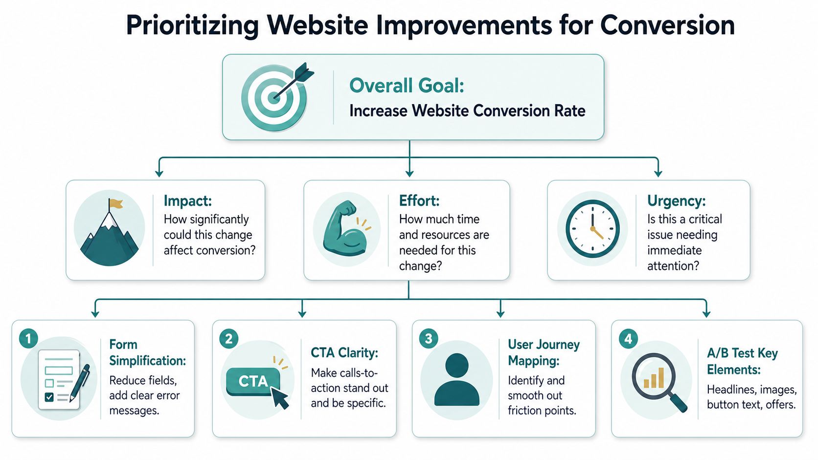
The businesses that get traction treat CRO like operational work. They rank changes by impact, effort, and urgency, then work through the list in that order.
Use a simple priority filter
You don't need an elaborate scoring model. A practical version of PIE works well for service sites:
- Potential: Could this fix remove a major trust or friction problem?
- Importance: Does it affect a page that already gets strong intent traffic?
- Ease: Can your team implement it without rebuilding the whole site?
That filter quickly separates high-value changes from nice-to-have ideas.
Here's how that usually plays out:
| Change | Potential | Importance | Ease | Priority |
|---|---|---|---|---|
| Add trust signals above the fold on core service pages | High | High | Medium | Do first |
| Rewrite vague CTA language | Medium | High | High | Do first |
| Reduce form fields and improve error states | High | High | Medium | Do first |
| Redesign entire brand look | Unclear | Medium | Low | Defer |
| Add extra animations | Low | Low | Low | Skip |
This is why broad redesign projects often disappoint. Teams spend time on visual refreshes while the main leaks stay open. A cleaner logo doesn't fix a weak intake path. A new font doesn't answer trust objections.
A useful outside perspective can help if you want additional ideas for how to turn website visitors into customers, but the priority rule stays the same. Start where buyer confidence or next-step clarity is breaking.
Measure business outcomes, not prettier dashboards
The goal isn't to win a conversion-rate argument. The goal is better leads.
Track outcomes that connect directly to sales capacity:
- Qualified inquiries: Not every form fill counts equally.
- Booked consultations or estimates: A stronger indicator than raw submissions.
- Call quality: Are calls relevant to the services you want?
- Lead source by page: Which pages create serious demand, not just traffic?
- Close feedback from intake or sales staff: They hear the objections your site didn't answer.
That last point matters more than many teams admit. Intake staff, office managers, and sales reps often know exactly where the site is underperforming. They hear the repeated confusion. They know which leads arrive informed and which arrive hesitant. CRO works better when their feedback shapes your priorities.
A higher conversion rate only matters if it produces better conversations, better appointments, and better-fit clients.
The strongest service websites usually improve in a sequence. First they clarify the offer. Then they build visible trust. Then they reduce friction in the inquiry path. Then they tighten performance and testing. That order tends to beat random redesign cycles.
If you're serious about how to increase conversion rate on website performance, think like an operator, not a trend chaser. Fix the pages with intent. Strengthen the trust layer. Remove the friction. Measure what turns into real business.
If your website gets traffic but doesn't generate enough qualified leads, Digital Skyrocket helps service businesses turn rankings into calls, form submissions, and booked consultations through focused web design, SEO, AEO, and CRO.